Frances & Joe’s Wedding Invitations: Chapter 3 — Meetup at The Kitchen
It was Monday. I needed a strong cup of coffee.
Joe told me he knew a good place to have lunch — and the best coffee.
We dropped into this “cozy” bistro in Jersey City close to where I work. “Cozy” is such an appealing word to hear in the middle of December.
Not too long ago, Joe and I had worked together at The Star-Ledger in Newark, N.J. During those days, dinners at our desk involved either ordering take-out from a local spot, warming up a dish from home and/or shaking down the vending machine for a bag of chips and a soda. We always had to eat fast as the seconds ticked by, deadline gaining on us. These days, at least, we could meet up for a bite now and then, and eat and converse at our own pace.
This time, we met up at The Kitchen at Grove Station on Marin Boulevard. Joe had already arrived, seated at a marble-topped café table. The dining room was cast in a dusky sunlight, diffused through a wintry layer of clouds and the café’s windowpanes. I immediately ordered a cup of coffee while we sized up the menu and made our selections with the waitress.
Inside The Kitchen at Grove Station. Joe and I were seated at the marble-topped café table shown here. Photo courtesy of The Kitchen at Grove Station.
While we waited for our lunch, we chatted about work, went over our plans for the holidays, dusted off some old laughs. He had the cheeseburger, dressed to the nines and delivered under a dome of ethereal smoke. I had the butternut squash soup, velvety and of that temperature between warm and hot that can silence you into submission all meal.
Luxuriating over our coffee (from Jersey City’s own Mod Cup, for those who are curious), he asked if I’d like to design the invitation for his and Frances’ wedding. I didn’t need much convincing. I told him that I would love to do it. I had designed invitations for my own wedding years ago, and looked forward to having that experience again.
Our bellies warm from the hot lunch, our minds relaxed, we discussed some of the particulars before eventually sharing a hearty handshake and going our separate ways back out into the chill.
Food is love
Frances and Joe love food, as do I and my wife, Rachel, who’s a food writer and chef. Between the four of us, we've bonded over Chef Emma Taylor’s ice cream at Milk Sugar Love, tacos and cocktails at Orale Mexican Kitchen, burgers and beers at White Star Bar, meatball sandwiches and paninis at the Roman Nose and cuisine at other Jersey City hot spots.
Frances has food in her blood. Her parents met at the Ashford Club, a former city club in Atlanta. Her dad was the sous chef, her mom a waitress, and for their first date, he made fried lobster tails. Frances continues:
“Growing up my sisters and I were always my dad’s sous chefs, helping to make hollandaise sauce and soufflés, whisking whipped cream by hand. Like my dad, cooking for people is a way to show love. The first time I cooked dinner for Joe, I made salmon and cheese grits. And I remember the first time I made a soufflé without my dad. It was for Joe and I. They rose beautifully.”
Of course, it was only natural that Frances suggested that I draw the food for the R.S.V.P. card, which presented guests confirming their attendance at the wedding with a choice of menu options at the reception dinner. I thought that was a great idea.
Reception dinner menu, in drawings. Clockwise from top left, a plate of filet mignon with peas and mashed potatoes, a creamy mushroom risotto with asparagus spears, and lobster tail with lemon butter.
Food is art
The menu on the R.S.V.P. card included risotto, lobster and filet mignon. Since I didn't know exactly how the food would be presented or what the sides might be, I used my culinary imagination to stage the dinners on elegantly arranged platings. To compliment the other drawings on the invitation and travel information card, which we've talked about in detail in previous chapters, I sketched at the same perspective and imbued the sketches with a dash of whimsy.
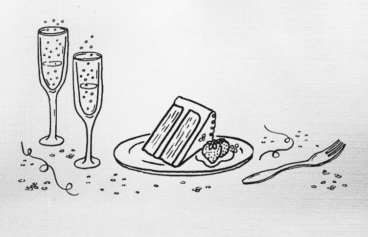
For the second-reception card, a scene of celebration — effervescent champagne, sliced cake with berries, and confetti.
Coming up with a visual anchor for the invitation to the alternate reception in Georgia — for those who couldn't travel to Boothbay Harbor — had been a bit more challenging in the early going, mostly because the possibilities are endless. But once Frances came up with the idea for drawing the food for the R.S.V.P. card, I thought tying the two together would be ideal. Among the many ideas I sketched out, I thought of drawing brush lettering, as if icing, on the top of a slice of cake. However, because of the relatively small size of the card and the amount of text required, the scale of the lettering would've been too small. I eventually came up with a mix of champagne, sliced cake and confetti, which gave the collection a stage to express the idea of celebration.
With the illustrations done, I returned to developing the typography and layout across the entire collection, jumping off of the work I had already done on the invitation. The invitation also needed to evolve in order to work cohesively with the entire suite. New styles of lettering were drawn to add variety and a spirit of fun and the unexpected. I would be halfway there.


