A ‘New View’ on ITC Avant Garde Gothic
The album cover features a title treatment by Mike Reddy.
The latest album from the brilliant singer-songwriter Eleanor Friedberger features packaging design by artist Mike Reddy. He makes use of ITC Avant Garde Gothic throughout, and complements it with his sharp type design in the title treatment on the album’s cover and disc face.
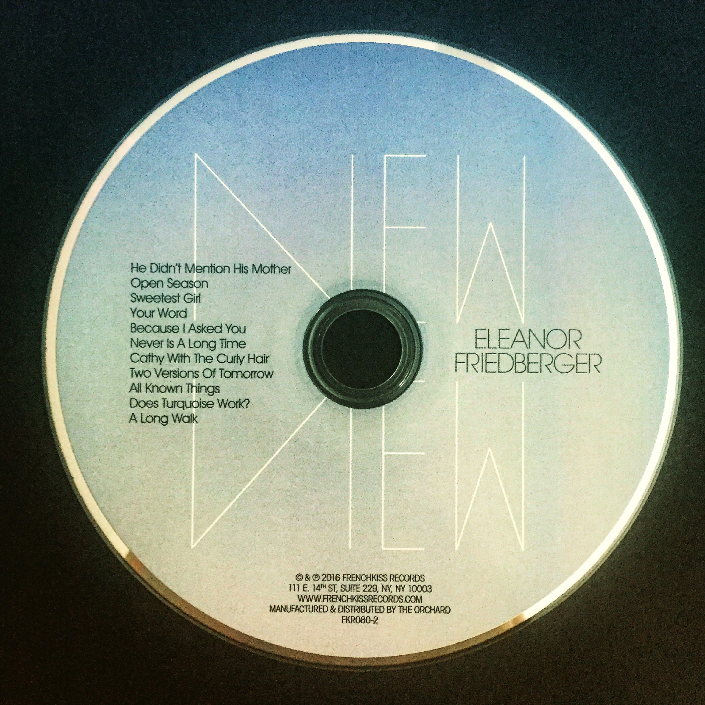
In the title treatment, notice how the slender formations in the ‘V’ and ‘I’ in “View” act as a mirror to the shape of the ‘N’ in “New”. It all complements Mr. Reddy’s use on the cover of the same image of Eleanor Friedberger receding in a cascade of proportional reductions, set off individually by borders of equal optical weight to the typography. The type treatment is contrasted, too, by the flood of black, which hugs everything.
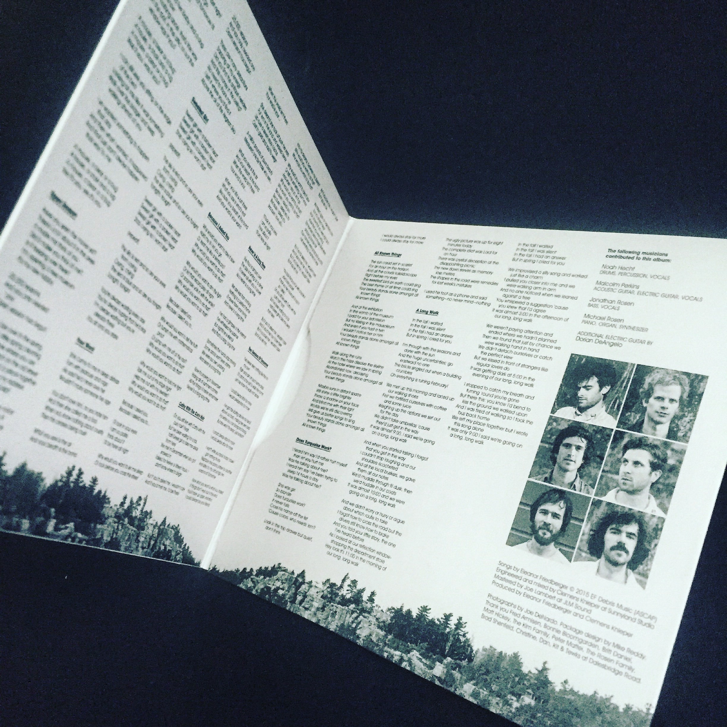
Beyond the cover: Song titles, lyrics and musician photos set in ragged columns of varying weights of ITC Avant Garde Gothic hang above a Rorschached rocky canyon on the inside panels.
On the disc’s face: Repeated use of the title treatment layered on top of a soft gradient that evokes twilight. Song titles and Eleanor Friedberger’s name set in ITC Avant Garde Gothic.
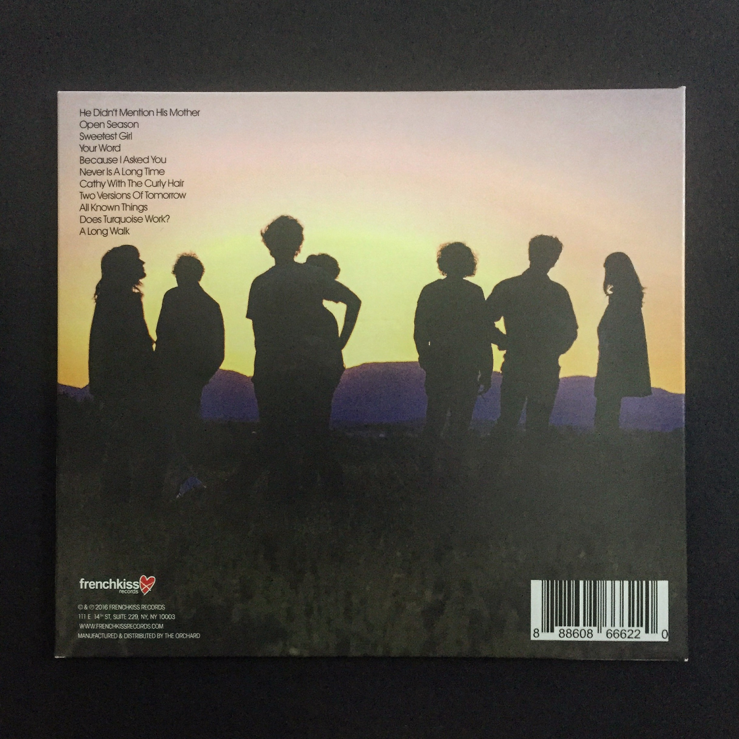
On the back cover: A sunset silhouetting the band, song titles also set ragged in ITC Avant Garde Gothic in the upper-left corner.
It all adds up to a sharp package that adds to the overall experience of listening to the music.
Eleanor Friedberger is currently on tour. Among her many dates, she will be making a stop at MilkBoy in Philadelphia on February 19. See you there!
The inside panels feature varying weights of ITC Avant Garde Gothic.
A close-up on the lyrics.
The disc’s face features the sharp title treatment.
The back cover features ITC Avant Garde Gothic in the upper-left corner.
The back cover features ITC Avant Garde Gothic in the upper-left corner.


