
Recurring Pledges by Kickstarter
I collaborated with two other user experience designers to expand Kickstarter’s one-time pledge funding model to allow recurring payments.
This is how we did it.
a prologue
For my next project, I was assigned to add a new feature to an existing product. But before the project began, I was paired with two other user experience design students, Bani and Andrew. Our challenge for this project was to expand their signature feature to allow projects to accept recurring payments on a repeated schedule instead of the standard one-time payment. Our brand was Kickstarter.

Kickstarter is a crowd-sourcing website, launched in 2009, that allows patrons to fund a wide variety of projects from independent artists and innovators. Currently on Kickstarter, users can back different projects by making a one-time pledge, often in return for a reward or perk from the project creator. Projects are only funded if they reach their funding goal by a predetermined date — Kickstarter’s “all or nothing funding” approach. Since their launch, 11 million people have backed a project, $2.3 billion has been pledged and 103,565 projects have been successfully funded.
Kickstarter is a benefit corporation. Benefit corporations are for-profit companies that are obligated to consider the impact of their decisions on society, not only shareholders. Radically, positive impact on society becomes part of a benefit corporation’s legally defined goals.
So, how do they make money? Kickstarter takes 5 percent off the top of successful campaigns. From their profit, they give 5 percent to charitable organizations.
case studies
During our initial research, we found a lot of qualitative and quantitative data about users’ relationship with Kickstarter. We also uncovered stories of success and failure.
Kickstarter has had a lot of horror stories over the years, such as the failure of the handheld Zano Drone.

The Zano Drone
The company hired a journalist to find out what went wrong and why the project couldn’t deliver on its promise to investors after shipment of only 600 of more than 15,000 units. The failure was reportedly due to “a misappropriation of funds.”
It is a magnification of a larger issue we saw in our research: After a project meets its fundraising goal, its creators lack the preparation and resources to fulfill the backlog of demand. We read stories of investors who would wait years for their perk, in the cases of more generous backers, their own version of the final product.
More controversy in 2013 when “Scrubs” star and independent film director Zack Braff set out to fund his latest film, “Wish I Was Here,” through Kickstarter. Some 47,000 backers pledged $3.1 million. Going through Kickstarter gave Braff “the benefit of total creative control over his film,” he said at Sundance during the premiere of the film. But that didn’t make others question the needs of a highly successful TV actor to go to Kickstarter to fund a movie.
Same questions were asked when Rob Thomas, the producer of the cult TV series “Veronica Mars,” used the site to raise funds for a follow-up movie. Some 92,000 backers pledged $5.7 million. With both films, the Kickstarter investors would not receive any additional perks if either film became a smash, which is typical for outside investors.

But despite the failures and controversies, we found many success stories. We discovered that Cards Against Humanity, a popular party game “for horrible people,” as it says on the box, began on Kickstarter. The project, known for its strong user engagement and one of the most successful Kickstarter campaigns ever, set the goal at $10,000. The creators were able to engage users quickly and incentivize their involvement in the project because the perks gave investors a stake in the creation of the game through content and more. This eventually led to a loyal community of players and projects to raise funds for expansion decks.
During their crowdfunding phase on Kickstarter, Cards Against Humanity blew past their goals by more than 300 percent. This was, without question, a crowdfunding success story, and the dream of many who submit a project to a crowdfunding site.
From Exploding Kittens to smartwatches to 3D printers, there have been other successful Kickstarter campaigns, too.
In a similar strategy to Cards Against Humanity, Whole Hog Games ran an in-game contest to keep the momentum going in the last third of its campaign. Digstarter, its in-game contest, asked fans to find and collect gems as they played Full Bore. The more gems found collectively, the more the team rewarded its backers. This unique contest incentivized current backers to stay involved and prospective backers to get involved. More importantly, Digstarter helped the team avoid a fundraising slump in the last third of its campaign.
creators share best practices
To back up those studies, it goes without saying that choosing the right rewards structure for your project is vital, but project creators revealed a big pain point in the case studies we found: “The part that takes the longest is deciding the levels of rewards.” Beyond the difficulty of setting up your rewards plan, project creators had some best practices to share when it came to crowdfunding on Kickstarter:
- Get to the point: Potential backers might only read the first sentence and look at images. You need to make an immediate impression.
- Be visual: Too much text and not enough eye candy will overwhelm and bore potential backers.
- Introduce your project and team in a video: Potential backers like to feel a connection with the people to whom they are investing.
key stats from the case studies
- The project categories that get the highest average pledges are Technology, Design and Film & Video, in that order. It’s the same with all the failures.
- Without a doubt, the $25 pledge range is the most popular, most selected award level.
- Subcategories that imply physical products, ones that require materials, time to manufacture and shipping, are also those that get the highest average pledges.
- Hardware, tech gadgets and other physical products aren’t quite as successful, on average, as board games, but they’re still approximately five times as likely to be mega-hits compared to the average crowdfunding project. Famous examples include Pebble watches, 3D printing and the Coolest Cooler.
- If you want your crowdfunding campaign to be a viral hit, consider making a tabletop game. Just under 3 percent of all Kickstarter campaigns in history have featured tabletop games, and yet nearly 25 percent of the thousand most successful fall in that category.
- The three most popular categories on Kickstarter for creating projects are music, documentaries and film shorts, each of which has seen over 10,000 campaigns. They’re also the least likely to succeed — only 25 have cracked the top 1,000.
- Crowdfunding is all about offering incentives. The data suggests $50 is the most important pledge on your list. No matter how you slice the data, the median amount pledged per backer winds up right around $50.
- In practice, the shoot-for-the-stars strategy rarely works. Backers prefer a believable path to success, not a multi-million-dollar pipe dream. In fact, the median funding goal for the thousand mosts successful Kickstarters is just $1,000 — five times less than the median goal among all projects.
- About half of all projects reach their funding goals, but Kickstarter says it has a 9-percent failure rate on the delivery of perks.
- Projects that seek to raise under $1,000 are the biggest failures — at 10 to 15 percent.
These insights would help us later determine which projects would be best suited for a recurring payment method through Kickstarter.
discovery & research
We split up the research between all of us to focus on key comparative examples of recurring payment methods as well as funding models, and competitors with differentiating features, whether those features were successes or failures. We came together to make a list of potential comparative fundraising or crowdfunding platforms and assign them
This is what we sought to get out of each of our research methods:.
Comparative Analysis: How is the recurring payment method prioritized and what are the incentives offered?
Competitive Analysis: From those who have a crowdfunding platform, how do they serve the backer and creator?
Case Studies: What are the common threads between successful Kickstarter campaigns and some basic best practices from the creator’s perspective?
comparative analysis
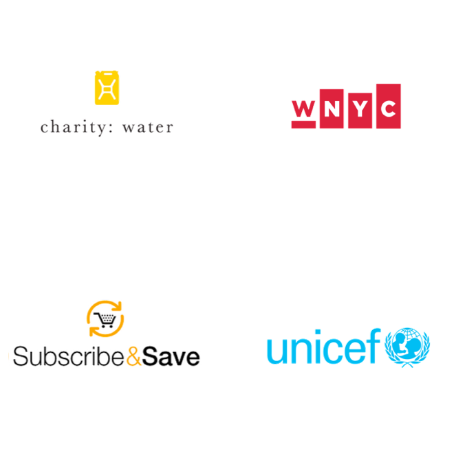
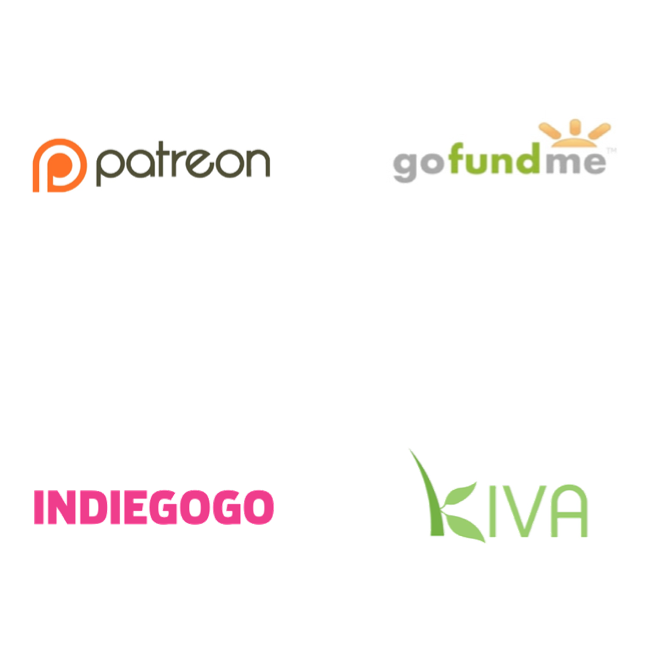
My assignment was to research the funding models and user flows of nonprofits such as WNYC and Charity:Water. Bani chose to research UNICEF and Amazon Subscribe & Save. Andrew would research funding models with direct competitors, including Patreon, Indiegogo, GoFundMe and Kiva. We did a comparison of each platform and their specific features.
These were the biggest takeaways from the comparative research I did:
- Charity:Water had the most elegant user flow — only 3 clicks to donate.
- Most of Charity:Water’s promotions are through social media. Over 60 percent of their donations are raised online, which is remarkable given that most nonprofits still struggle at online fundraising.
- Charity:Water’s projects last about 21 months, and their progress reports to donors were the most comprehensive I’ve seen, with maps, video and blog posts. The level of trust and accountability is high.
- WNYC offered up to 25 different perks to choose from when you donated money to the station on a one-time or recurring basis.
- For Amazon Subscribe & Save, it’s very easy to opt-out of the service, which is important when your payments are automatically recurring.
- When recurring payment was offered, Amazon prioritized it over the “add to cart,” which likely allows Amazon to bring in a lot more revenue while customers get the benefit of spending less over time.
- With UNICEF, it was more difficult to opt-out of recurring donations. This is a pain point we later validate in our user research.
competitive analysis
One common attribute among Patreon, Indiegogo and GoFundMe is that there are fewer limits on project creators to collect funds. Users can’t accept funds on Kickstarter without reaching their target fundraising goal. Not so with most of the competitors. Because project creators can keep the money whether they reach their funding goal or not, there’s less trust that a backer’s money will make a substantial difference.
There is also less vetting over the types of projects with Indiegogo and GoFundMe. They allow personal projects and charity campaigns. Kickstarter does not.
Meanwhile, Patreon’s business model supports artist over projects, which allows backers to fund over a longer period of time than 60 days. But Kickstarter does offer more perks with their projects, while their competition offers much fewer.
Kiva, meanwhile, has been in business longer than Kickstarter. It, like the companies on which we did comparative research, is a nonprofit business. Their slogan, “to connect people through lending to alleviate poverty,” represents a business where 100 percent of every dollar goes directly toward funding loans. Like the rest of the competition, the perks are few, but like the rest of the competition, they offer monthly or recurring payment plans for backers. The difference with Kiva: Recipients of loans are responsible to pay back their loan over time. Their site was least intuitive to use versus the competition.
To put it bluntly, Kickstarter has a stricter vetting process. In the words of Kickstarter via their website:
- Projects must create something to share with others: “Kickstarter can be used to create all sorts of things: art and gadgets, events and spaces, ideas and experiences. But every project needs a plan for creating something and sharing it with the world. At some point, the creator should be able to say: “It’s finished. Here’s what we created. Enjoy!”’
- Projects must be honest and clearly presented: “Our community is built on trust and communication. Projects can’t mislead people or misrepresent facts, and creators should be candid about what they plan to accomplish. When a project involves manufacturing and distributing something complex, like a gadget, we require projects to show backers a prototype of what they’re making, and we prohibit photorealistic renderings.”
- Projects can’t fundraise for charity, offer financial incentives, or involve prohibited items: “We’re all in favor of charity and investment, but they’re not permitted on Kickstarter. Projects can’t promise to donate funds raised to a charity or cause, and they can’t offer financial incentives like equity or repayment.”
The key question from our competitive research: How can we increase the funding options on Kickstarter, particularly the recurring payment option available with most of their competitors, without compromising their brand?
building a topic map
Before we began to embark on our user research, we wrote down all the different topics to account for on the project. The core of the challenge was “contributing to a project on a recurring payment method.” But connected to the main goal were issues of accountability, behavior and preference, motivation and guidelines on which projects would qualify for this new feature. Would it be open to anyone, or would it be open only to Kickstarter users who’ve already met a fundraising goal?
Screening For Our Interviews
With a firm understanding of Kickstarter’s strengths and weaknesses, and our competitive and comparative research complete, we began our user research with a screener. The questions we came up with were as follows:
- Do you live in New York City and/or Tri-State area?
- Have you ever used any recurring payment method? (i.e. WNYC membership, Amazon Subscribe & Save, etc.)
- Have you monetarily supported a cause, a business, or have crowdfunded a project?
The purpose behind the screener was to identify users within a specific region, particularly the New York City area, with whom we could set up a one-on-one, in-person interview. The subsequent questions were to target specific types of users, either ones who use a recurring payment method and/or have donated to a cause, business or crowdfunded a project. These users, when identified, would prove to be invaluable data resources for how behaviors, preferences and motivations affect how users approach crowdfunding, or utilizing their money in general.
Each person on our team sent out their own screeners using the same questions. I put the screener questions into Survey Monkey, and sent the screener out to my social network through Facebook and Twitter on Monday evening, the first day of our project kickoff. I was really excited to get some immediate responses, and they trickled in over into the morning. I sent out a reminder on both social media platforms the next day, and received several more responses after that. The respondents who replied “yes” to the first question, as well as either questions 2 or 3, would be potential users I could interview.
Interview Questions
In anticipation of interviews, we wrote out some sample questions to help keep focus on the goals of the project. In my experience, these questions help break the ice at the start of an interview before, in a best case scenario, it evolves into a natural conversation. The key is to ask “why,” and to keep the user talking about his or her experiences. This is just a small sample of the questions to which we sought feedback:
- How often do you contribute to a cause, business or crowdfund a project?
- How did you find which cause, business or project to which you wanted to contribute?
- How long have you contributed to the same cause or projects?
- What makes you contribute again to the same cause?
- How did you follow up with the organization or cause when you gave money?
- How did the organization or cause follow up after you made your contribution?
- How do you communicate with friends and family about where you contribute?
- What has been your incentive to enroll in a recurring payment method?
- What has your experience been in setting up a recurring payment or auto-pay method?
- What payment method do you prefer when setting up a recurring payment?
Our First Interviews
We also wrote out a version of the screener on the whiteboard in our classroom. Students responded to it immediately. Two users, one familiar with Kickstarter, the other not, answered “Yes” to at least one of the central questions. Both were available for interviews. The interviews were between 30 to 45 minutes each.
My first user had never before used Kickstarter or a crowdfunding platform to raise money or invest in someone else’s project.
The takeaways from the first interview:
- He has cancelled monthly auto-pay services, such as from a credit card company or a bank, in the past because they wanted more information about where the money being spent was going before the bill was taken out of their checking account. He likes that their cable bill notifies them of the cost and date of withdrawal beforehand.
- Does not generally contribute to causes on a recurring payment model, only donates when prompted by email marketing or within their social network. Generally prefers to volunteer time to causes over spending money.
- Contributes to causes that directly affect him or the community he lives in over the long term, such as ASPCA, for more than 6 years, and Broadway Cares, for more than 10 years.
The user in my second interview had been a project creator on Kickstarter, and was currently a user of the platform, mostly to invest in friends’ projects. At the time, she had funded more than 18 different individual projects, many of which they found through social media. Their overall experience with Kickstarter was positive, although she did validate a pain point we found in our research — the fulfillment of investors’ perks on a reasonable timeline after a fundraising goal has been met.
The takeaways from the second interview:
- Funds projects on Kickstarter regularly — 18 total since 2011. She contributes to people she knows, whom she discovers through word of mouth or social media. Most of the projects she has given to have been able to reach their fundraising goals. Asked why she didn’t contribute money to an industrial design project that she found cool on Kickstarter: “I didn’t know them.”
- Has created a successful project before through Kickstarter to raise over $800 to build a rooftop apiary in Queens. She kept investors up to date on the project’s progress, as recommended by Kickstarter. The outreach from investors took her by surprise, as they were quickly able to reach their fundraising goal. Despite some unforeseen setbacks after reaching her goal (i.e. losing a hive), she was able to eventually ship out the rewards to their investors.
- Small donations are most typical. Most donations she received were $25 pledges.
- To pay and accept donations, she used Amazon Payments. She found the payment process to be clunky, especially if you already have an account with Amazon.
Another Interview
From my screeners, I sent out invitations for interviews, with two people getting back to me quickly, but only one person available within such short notice. Bani would interview another user who responded to the screener, while Andrew would interview two more respondents from his sources.
I met my user the next day at 5 p.m. for a 45-minute session. With their permission, I made a voice recording of the interview, just in case I might need to extract more than I could synthesize in my handwritten notes.
The key takeaways from the interview:
- Not a fan of incremental bill pay. Prefers the security of paying bills via mail or paying subscriptions on a yearly basis. “I like to have control over the amount and frequency of bills I pay.”
- He used Kickstarter once to fund a friend’s independent film. Made one-time $50 donation. Found out about it through an email blast. In the interview, he said he was “not shopping for causes.”
- Makes several charitable and nonprofit contributions throughout the year, but makes them on an annual one-time basis. A common thread between all my interviews: They like to contribute to causes that directly affect them or people they know.
Sending Out Surveys
After pooling our screener results together, we had people who had not committed to an interview. We sent out a survey through Survey Monkey to those remaining users. The survey contained 10 questions from the aforementioned pool of interview questions. They were slightly rewritten to take into account the format of the survey. We got 14 responses back. Because we received only six of those 14 responses in time to properly synthesize them, we would use the eight late responses to validate the goals and pain points of our targeted user archetypes, or personas.
Affinity Mapping
Gathering our notes and responses from user interviews, surveys and case studies, we began to synthesize our data into meaningful insights or trends that we could use to further pursue our design objective.
From all the research we were able to gather as a team, we wrote all the valuable insights from each of nine interviews and six survey responses on Post-Its and stuck them to the wall. We first set out to organize them by origin.

Bani begins the process of coalescing her insights from her interviews into groupings.

Andrew groups his insights by interview before we regroup them into separate categories.

Andrew and Bani look for patterns in the insights during our affinity mapping synthesis.

Before our synthesis began, our insights were grouped by their origins.

A close-up of our progress., a highlight of our demographic insights.

Our survey results generated a lot of responses to synthesize.

The entire process lead to this affinity map. From this exercise, key insights were discovered.
Key Insights
Through the affinity mapping, we discovered the key motivations and incentives of our users. Some are contradictory, which would come in handy in the divergence of creating multiple personas, or archetypal target users, to help advance our objectives for this project and tell the user’s story.
- “I tend to give and forget. I don’t need progress reports.”
- “I like to know of progress in a timely, succinct manner.”
- “I need social reassurance to contribute.”
- “I like to give money to causes that affect me directly.”
- “I only like to give to people I know.”
- “I find out about a project or cause through social media.”
- “I like to get “cool” perks or incentives.”
Below are the main patterns of behavior and preference of our users.
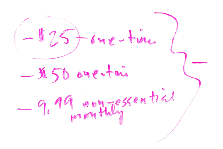
- “When I give, I tend to spend less than $50.”
- “$9.99 is my monthly recurring payment max on non-essentials.”
- “I really don’t like to share my involvement in a cause unless asked.”
- “I prefer to spread out my funding.”
- “I contribute infrequently.”
- “I am a die-hard supporter.”
- “I fund frequently.”
- “I like to know a lot about a cause before I commit.”
Personas
From those key insights, as well as from the demographic data of the participants in our interviews and surveys, we were able to build three strong personas, or targeted users, to help guide us to a solution to our challenge.
Our first, and primary, persona, Mia, is a 34-year-old freelance food writer living in Queens. Her profile is filled in with information we got from our research, particularly her goals and pain points. From other footnotes from our research, we extrapolated key characteristics of her personality, as well as her favorite brands and causes. We would use Mia as a golden thread throughout our user experience process.

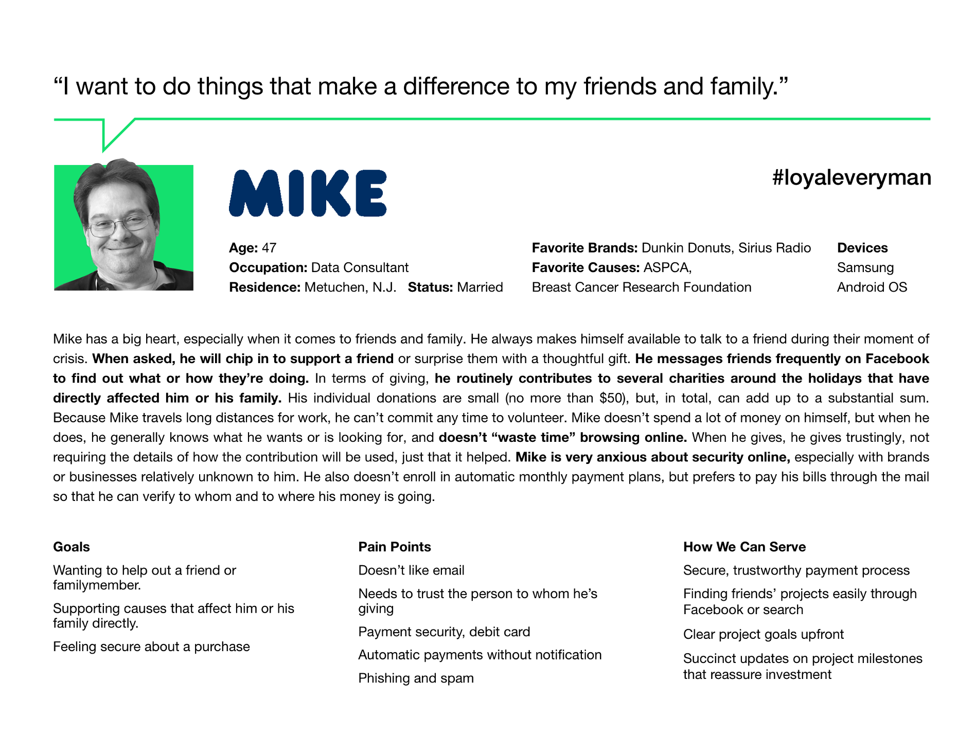
Our other two personas, Mike and Chao, were developed from contradictory data from our interviews and surveys. Chao was our secondary persona, while Mike was our tertiary persona. Mike may only typify about 20 percent of our target audience, while Mia and Chao would characterize the main 80 percent of our targeted user base. We cross-checked our personas with the remainder of our survey responses. Our late respondents confirmed our trends.

Ideation & Design
After we developed our personas, we moved on to the ideation and sketching phase of the project, trying to come up with as many ideas as possible to implement. We took ideas from competitors, such as Patreon, to develop recurring payments built around milestones. Patreon funds artists, while Kickstarter funds projects.
But Patreon isn’t so much time-based, as milestone-based. We decided that because one of the pain points of Kickstarter project creators is knowing how much time is required to complete a project, we thought that making projects on a recurring payment plan milestone-based instead of time-based would help alleviate a pain point for current users.
We also thought that by only allowing current Kickstarter users, who’ve met a fundraising goal, to qualify for the extension would solidify trust with prospective investors, as well as build brand value and loyalty.
Referring to the case studies from our research and interviews, we also zeroed in on the types of projects likely to receive the recurring payment extension.
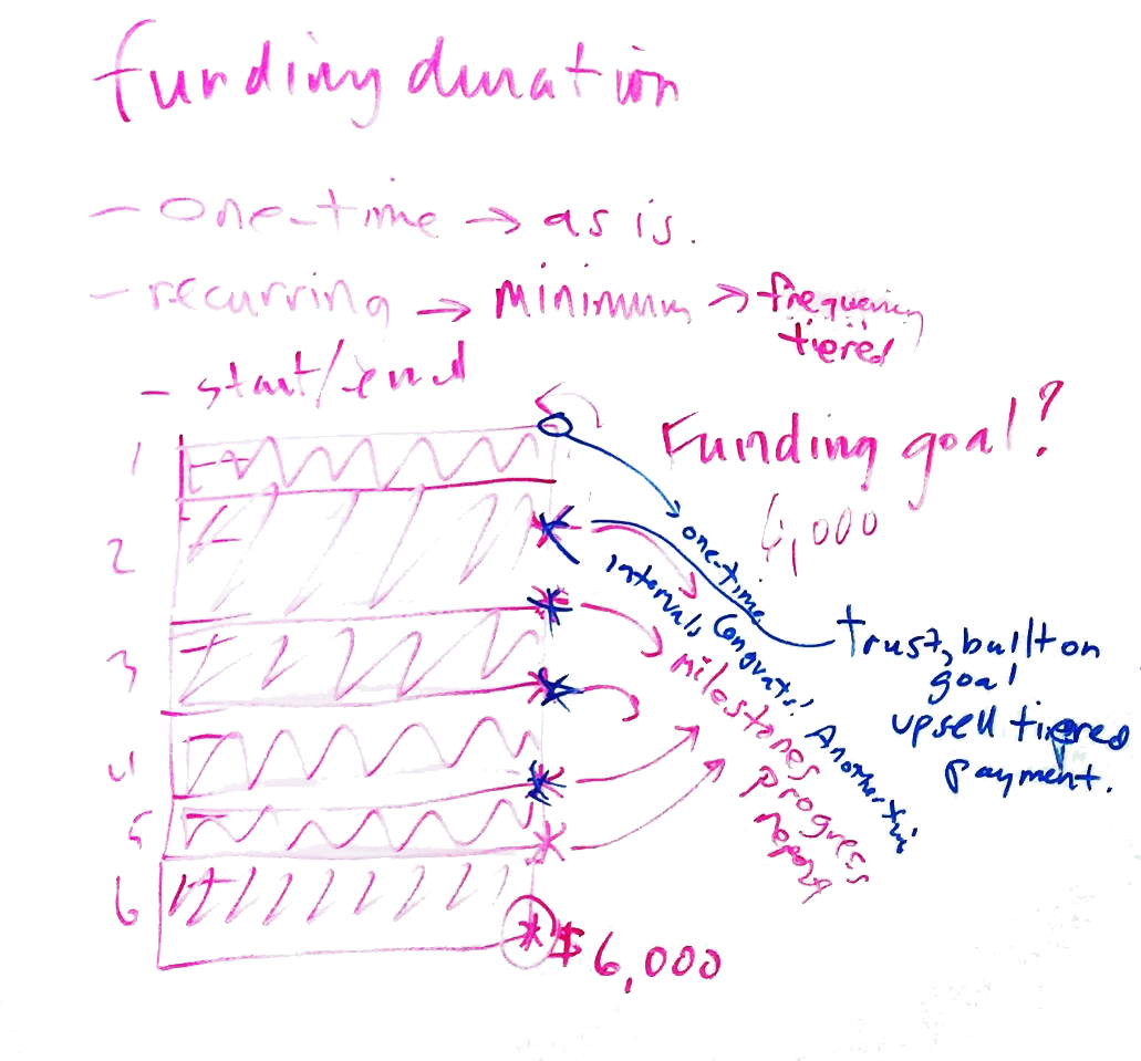

During the ideation phase of the project, we worked through many of the ideas gathered from our research and interviews, including the types of projects that might be eligible for a recurring payment method, what would be the standard monthly pledge and how the recurring pledge system would work.
The Creation of “Kickstender”
From the competitive and comparable research we did, we went to the whiteboard and began sketching ideas for what features would help accomplish our goal.

Through the ideation process we came up with a term to communicate the new feature we were to offer: Kickstender. There was an excitement that we could build the term in the new design. We were quickly in love with it. But, through testing, this would prove to be a miscalculation.
Finding A Solution
Our solution would have to solve for our users’ needs, as well as our stakeholders at Kickstarter.
For the project creator, we need to minimize the steps to set up a recurring payment project. We also need to simplify setting up rewards, which is a big pain point for our creators.
For the backers, we need to maintain the look and feel of Kickstarter, make it more accountable, an ability to opt-out easily and keep incentives a big motivating factor to contribute.
For Kickstarter, we can’t compromise on the integrity of any projects or add a lot of extra elements. We also need to stay true to the brand.

Feature Prioritization
Which features were essential and which were not? Because we were on a finite timeline and because our strategy was to change as little as possible about how users navigate Kickstarter, I prioritized each new possible feature on a grid. Essential and non-essential features would fall on the x-axis, while high effort and low effort would be the extremes on the y-axis. We would eventually focus on the features in the lower left quadrant. These would enable us to have an MVP, or minimum viable product, to test and release.
Design Studio
As a group we did sketch drills. We agreed on a goal for which to visualize a solution. Then for six minutes, we each sketched an idea for how to achieve the goal. Then for three minutes each, we presented our ideas to the group. Then for an additional two minutes each, we critiqued each other’s work.

Clockwise from top, Bani, Andrew and I sketch as part of a design studio to find visual solutions to reach our goal.
Sketching & Wireframes
From the design studio, I did my own sketches, as I volunteered to do the wireframes for the home, discovery and topic pages. These pages would not change much from their current design. Our goal was not to change that much if anything in the user flow. The only thing we would play with is how to display messaging to communicate to the user about the new feature.
We built “Kickstender” into our early sketches and messaging. But as we got deeper into the process, we kept questioning whether it muddled the brand. So we switched to terms such as “Extended.” Again, we questioned whether it was too vague. We needed to test it. We agreed to not concentrate on it so as not to be distracted from the design of the user flow from discovery to checkout.

Quick sketches of the pages I was assigned to do for my team included the home, discovery and topic pages.

Earlier sketches of the pages I was assigned to do for my team included the home, discovery and topic pages. “Kickstender” would be added to the custom navigation within the topic page, according to these sketches.
In Sketch 2 (above), the terminology would later change to “Extended Projects” instead of “Kickstender.” But what does “Extended” mean?
In Sketch 4 (above), a pop-up alert would prompt users to projects they’d funded in the past being extended on recurring payment plan.
A sketch of the home page doesn’t change any of Kickstarter’s current information architecture.
From my sketches, I would reproduce the designs in Sketch, first in low-fidelity — without images or color — for our first user test. This way our users can focus on the functionality of our design. Later, I would iterate the wireframes to high-fidelity versions.
prototypes
With the first iteration of the prototype, Bani took our wireframes from Sketch and built the functionality into each page using InVision. Bani was responsible for the project page and checkout flow. Andrew put his focus on the project creator flow for a current user who wants to extended a successful project. Again, with that sign-up flow, the goal was to not add any additional pages to the already seven page first-time user sign-up flow.
Testing & Iterating
Once our prototype was ready for testing, we set up appointments with two users to get their initial impressions and run them through a scenario that would test the strength of our solution.
For user testing, we set up a MacBook Pro laptop and a basic mouse with scroll-wheel. Our primary persona, Mia, uses a MacBook Air as her primary device, as well as an iPhone. With permission from our users, we recorded each session from two different angles. One camera from our laptop shot footage of their facial reactions to their interactions with the prototype. The other was recording their movements directly on the screen. It would record their clicks, scrolls and time spent fulfilling a task.

For testing, we set up a laptop with a mouse. We used Quicktime screen capture to record the movement of the cursor during the testing. We also set up a second laptop to record the user’s reactions.
Both of our users were familiar with Kickstarter and how it works. This was helpful since our group had made a design decision during our ideation process to not add complication to an already smooth process for users.
Before testing began, we wrote out a scenario to give the user a goal to achieve. But before the scenario would begin, we told our users, “before you click on anything, please give me your first impressions of what you see and what you expect to happen when you click on things.
Then came the scenario: Imagine you’ve heard through social media that a beekeeper in your neighborhood is in need of additional recurring funding on equipment and staff for the coming year. Using the site, find their project and choose to fund it on a recurring payment of $6 a month.
During the first user test, I was the facilitator.
During the second user test, Bani was the facilitator.
Takeaways from the first user test:
- He easily recognized Kickstarter’s interface, which was pleasing to him.
- “Kickstender.” “Extended.” These words didn’t register, and even confused the user about what they meant.
- The user noticed that the project was broken into phases, but couldn’t ascertain the project’s current phase. “Was ‘Phase 1’ the original project?”
- He acknowledged with the new feature that “there’s too much of a learning curve.”
Takeaways from the second user test:
- She also recognized Kickstarter’s interface, nimbly navigating to the project page.
- Once on the funding page, the user found the recurring payment options confusing. “Why would I want to sign up for recurring payment?”
- The terminology, such as “Kickstender” or “one-time vs. full project” was unclear.
- A second payment screen, currently part of Kickstarter’s checkout flow after agreeing to fund a project on the project page, was redundant to her.
- “Phases” was not immediately clear to her. Suggests “milestones” might be better.
- As mentioned during the first user test, she said “there’s a steep learning curve” now in how she funds a project.
The biggest insights from both tests was that we, with this new feature, had made the process less intuitive for users. Both said we made the learning curve steeper. Our users mental models of Kickstarter had easily gotten them to the project page, but from there, the user’s flow immediately stopped. Because of this setback, we had to re-evaluate our design solution.
As far as messaging, “Kickstender” confused users already familiar with the Kickstarter nomenclature. It would be a lesson in not falling too in love with an idea before you’ve tested it. You have to trust users when they tell you it doesn’t make sense to them.
The Solution Evolves
Based on our user tests, we adapted our problem statement: How do we add a recurring payment method on Kickstarter projects while neither jeopardizing what the brand stands for nor what the user is used to?
What we learned from our users
Our process needed simplification. Our users were very confused by what they experienced. That’s what we learned from the user testing. Our users were familiar enough with Kickstarter to be able to get from the home page to the project page without too much hassle. One user in particular said, “This looks exactly like Kickstarter.”
Key takeaways from the user testing, we are follows:
- The words “Kickstender” on the home page and “extended” on the project page were confusing to our users. They didn’t understand what they meant and, in the case of “extended,” made them think a project had been extended beyond the original 30- to- 60-day deadline. “Kickstender” might’ve just proved to be too clever a to be effective.
- The call-to-action buttons on the project page were too similar, confusing the user as to what to do. Part of the problem here was that the project could be funded on a recurring or one-time basis, which when given equal weight, didn’t bring emphasis to our recurring payment model.
- Phases, a key feature of our recurring payment goal for Kickstarter, were not communicating to our users that they could fund projects over multiple phases at a time.
- The biggest hurdle was the multiple options available to our users to pledge money by selecting an amount, and in conjunction, a reward or perk for their contribution. Kickstarter has a simple hierarchy, listing the pledge amounts and rewards in order of low cost to high cost. Our new model disrupted that flow. In stitching another tier of recurring payment amounts and rewards next to their one-time counterparts, we did harm to an already learned behavior of Kickstarter users. Not only that, but our messaging was flawed, not communicating clearly what a recurring payment would mean for our users.
- In our interviews and surveys, it was clearly articulated that our users didn’t like it when third-parties would automatically opt them into recurring payment methods without their knowledge. To address this, we added a checkbox to the payment page that the user must authorize the recurring payment opt-in, which they technically had agreed to when they selected paying, for example, $6 per phase completion. This payment agreement would add in another layer of protection as well as the feeling of trust and security for our users.
Second Iteration
In our second iteration, we went higher fidelity with our prototype. We went full color, and wrote a lot of new microcopy to bring a realism to the mock-ups. From the second iteration, we built a user flow for Mia, our primary persona.
To solve for the problems found in our first two user tests, we implemented several changes.
- First, we eliminated the use of “Kickstender” or “extended” on any of the pages to keep the Kickstarter experience pure.
- We put emphasis on the recurring payment model by making the “Back All Project Phases” button bigger and reducing the option to “Make a One-Time Payment” to text only under the primary button.
- We added a progress bar, larger than the standard used by Kickstarter, above the “Phases” portion of the project page. This would help communicate more urgency to the user, as well as, highlight the individual phases.
- In tandem with adding emphasis to the “Back All Project Phases” call-to-action at the top of the project page, we followed suit at the lower portion, choosing to simplify the pledge options to two: Basic and Premium. Basic pledge amounts are based on what our personas would be willing to pay for on a recurring schedule. The Premium is an option for people who want to pay more than $10 or $15 a phase. Limiting it to two options, with rewards or perks aligned to the individual phases, would make the flow easier for our users, and closer to what Kickstarter users experience already. One-time payments, again, would be diminished on these projects in linkable text under the two main options.
- We rewrote the microcopy on the payment page to make it an easier scan and to add a bit more prominence to it before a user makes a purchase. Further testing would help to prove whether more would be needed.
The New feature
Below is a detailed look at the pages created to include the new recurring payment feature. The first page in the series is the individual project page for Andrew’s Local Honey, a project that would appeal to our primary persona. The remainder of the pages include the reward selection page, payment, review and confirmation pages.
Next Steps
If given more time on this project, we would’ve liked to:
- Continue to iterate and test the design.
- Meet with a marketing team on messaging strategy and user education.
- Test and iterate prototypes for current project creators to sign-up for a recurring payment method.
- Add a live chat feature to help project creator set up their rewards plan.
- Design, test and iterate new feature into the current Kickstarter app.
What I Learned
During this project, I learned some key lessons about building a new feature into an existing architecture. First, you can’t be easily distracted by all the features that need to be improved or added. You need to focus on the features that are going to keep you on budget and schedule, all while giving you a focused solution that can be tested and released to market as an MVP.
I also learned how valuable personas are in shaping designs, and how they help you sell a design to clients.
Another important lesson I learned is that, if you’re not careful, a new feature can muddle or even disrupt what users already enjoy about a site. New features should add joy, convenience, accessibility, not frustration, to the user experience.