


The Slate redesign
In 17 days, our team designed a new responsive website for Slate, a state-of-the-art on-demand housekeeping, laundry and dry cleaning startup in New York City, to generate more lead users.
a prologue and overview
For my final UXDI project, I was assigned to work for an actual client with two other UX designers — Mor Weizman and Anthony Jebran. Our client was Slate, a state-of-the-art on-demand housekeeping, laundry and dry cleaning service in New York City. We were given a brief with some background on the company and a project overview.

“We just relaunched our website and app with minimal UX expertise and would love optimization help. We want to increase the lead conversion ratio of our website. Also, leads have been dropping off in the middle of the onboarding process.”
— Slate, in a brief on their then-current challenges
We would need to validate this problem, or discover the real problem and design a solution.
In 17 days, what my team accomplished, in overlapping chronological order:
Brand research: We researched the history of the company, how it got started, what its short-term and long-term goals are, who its competitors are, what its biggest challenges to success are and identifying its target market.
Stakeholder interviews: Five total interviews and follow-ups with the CEO, operational managers and developers.
Data analysis and synthesis: From Slate’s exclusive bank of user data, we discovered patterns in the numbers that would eventually lead us to our recommended solutions.
Competitive and comparative analysis: From Handy, Alfred, Q and FlyCleaners, we conducted in-depth research on Slate's competitors, many startups offering the same or similar services.
Heuristic analysis: We toured all of competitors’ sites and native apps as first-time users, taking extensive notes on what we experienced and how those experiences made us feel about the product.
User research: Studied and documented potential-user behavior and feedback during testing of the current Slate website and user flows.
Screeners and surveys: Developed several screeners and surveys for potential users, and current and former users of Slate.
User interviews: We conducted in-person and phone interviews with current, former and potential users of Slate’s services.
Contextual inquiries: A tour of their dry cleaning and laundry facility in Greenpoint, Brooklyn, as well as, a week-long trial of their 5-day-a-week cleaning service gave us insights into how the business works as an employee and customer.
Stand-ups and pin-ups: During the research process, presented our findings, problem statement and potential solutions to other UX designers for feedback and review.
Personas: Developed detailed dossiers on three different archetypal target users for Slate, reference points to guide us in our journey to solve our client’s ultimate problem.
Feature prioritization: With data from our extensive research, we prioritized a list of 50 possible features — some essential, others less so — that we would need to factor into our solution.
Information architecture: We reevaluated the current Slate website, and based on our research, reorganized the main navigation, footer and checkout flow.
User flows: Guided by our personas, we wrote stories for how our users would navigate through the new site.
Visual design: We began with crude early sketches, progressed to low-fidelity wireframes, and finally to a working medium-fidelity prototype of mobile and desktop versions of the website. We would test and validate our designs every step of the way.
User testing: With a working prototype, we tested our design on 13 users, recording and documenting their verbal and nonverbal feedback.
Iterative design: From our testing, we made extensive changes to our design to deliver a final high-fidelity mockup to our client.
Next steps: Because of the limited timeframe of 17 days, we also delivered a series of recommendations informed by our research to our client. These included further testing of the new design as well as advice on how to improve the usability of the native app.
brand research
After moving to New York from Mexico City, Miguel Zabludovsky founded Slate NYC in 2005 to provide the best eco-affordable laundry, dry cleaning, tailoring and home cleaning possible. His distinguished clients included Rent the Runway, Bergdorf Goodman and Alexander McQueen, among others.
In January 2015, Zabludovsky repositioned Slate NYC as a tech company specializing in daily home cleaning, laundry and dry cleaning. They continue to operate their own dry cleaning and laundry facilities in Greenpoint, Brooklyn, a unique asset in the market. They relaunched their responsive website and app in March 2016, as well as, acquired dry cleaning company Boomerang, which serves the West Village, SoHo and TriBeca.
Sarah Kessler’s Fast Company post about Slate and other on-demand startups in March 2016 titled: “Why a New Generation of On-Demand Businesses Rejected The Uber Model.” aroused great interest in the company among potential users and the tech community and gave our team background on their success metrics and overall trends in the highly competitive and ever-changing on-demand space.
The biggest trend in the story was Slate's embrace of owning the whole process, and the criticism of an Uber model, whereby businesses subcontract their services to freelancers. Per Kessler’s article:
“But Slate’s business, which started with service operations and later added technology, has been built with almost an opposite business philosophy as startups like courier service Postmates, grocery delivery service Instacart, cleaning service Handy, errand marketplace TaskRabbit, and the many other startups that embrace an Uber-like business model. While those “Uber for X” startups seek to distance themselves from the driving, cleaning, and delivering they facilitate, instead functioning only as a technology layer on top of other businesses, Slate fully believes that it is a cleaning and laundry company. “We’re not techies,” Zabludovsky says. “We’re cleaning 130, 140 houses every day.”
— Fast Company, March 29, 2016
Slate believes the quality of the service can truly only be guaranteed when they have control over the entire process, from operating its own dry cleaning and laundry facilities to training and scheduling its own housekeepers. Its core business model and how it operates is not like competitors Handy or Alfred, who, like Uber, hire freelancers to clean, paint, deliver groceries and more, the fate of whom lies in the hands of the users who rate them. This significant difference in how Slate operates versus its competition would become an asset, one we'd seek to elevate in awareness for potential users.
meet the stakeholders
Throughout the first week of the project, we conducted five stakeholder interviews spanning from the founder to the development team. Our goal was to understand the inner-workings of the company, including the programs they use, their goals, pain points, and where they see a need for UX optimization. We then synthesized the interviews to deeply inform our problem statement.
Miguel Zabludovsky
Role: As Slate’s founder, he oversees and manages Slate.
Pain Points: Slate user’s want the same keeper in their household, but keepers leave for various reasons, causing turnover. Users leave after the “free trial” week.
Goals: Achieve 500 users by end of year; smooth out the service; retain paid users.
Katie Shea
Role: As co-founder, is responsible for marketing, partnerships, lead gen and onboarding.
Pain Points: Tracking precise analytics is spread out on too many systems. Unsure why users are dropping off during onboarding.
Goals: Onboarding; improving the lead-to-trial conversions; Tracking data more precisely; Allow users to search their accesibility to the service by zip code.
Amanda Whelan
Role: As community manager, leads customer service team, conducts in-house walkthroughs, responds to customer requests.
Pain Points: Keeping track of user complaints and communicating their requests is too manual of a process. Uses multiple tools to workaround console.
Goals: Facilitate easier/clearer communication between users, keepers and the customer service team; ensure user satisfaction.
Eduardo Herrera
Role: As general manager, oversees management of the laundry facilities, drivers and hires keepers.
Pain Points: Tracking an occasional lost item; Unpredictable Internet blackouts prevent system from processing dry cleaning orders.
Goals: Maintain organization of the dry cleaning and laundry requests; Return clothes to users in a timely manner; Coordinating with drivers and keepers.
Roberto Miclescu
Role: As the lead developer, codes the web app and the back-end management console, oversees developer working on the mobile app.
Pain Points: Though they come with many benefits, templates can come with limititations to customizability.
Goals: Fix errors with the web app; Add more functionality to the back-end service management console.
data is treasure
Soon after our stakeholder interviews, we got a link to Slate’s Google Analytics, as well as copies of their recent data on conversion rates in our Google Drive. The conversion rates were compiled on a spreadsheet with data ranging from September 2015 to April 2016. The rates were separated into three categories: Visitor-to-lead, lead-to-trial and trial-to-paid.
- The visitor-to-lead is the ratio at which visitors to the site begin the sign-up process.
- Lead-to-trial is the ratio at which users who fully or partially sign-up become first-week trial users. Some Slate users, depending on when they signed up, received a discount their first week. But every user receives a 5-day-a-week home cleaning their first week. Slate insists users experience the best clean the service can offer their first week.
- Trial-to-paid is the ratio at which first-week users become full-time paid users of the service.
- As part of synthesizing all these numbers, I also calculated a visitor-to-paid ratio to paint an overall picture of how many visitors eventually become paid users.
Google Analytics gave us direct access to their site traffic, desktop and mobile browser breakdown and demographics. We would eventually synthesize these numbers to reveal some overall trends.
Mor and Anthony actively seek patterns in Slate’s Google Analytics spreadsheet on user preferences.
From the analytics given to us, I was able to pinpoint conversion rates, as well as key visitor-to-lead and lead-to-paid user ratios.
Slate’s most popular option is a home cleaning 5 days a week at the $20-a-day option for a 1 bedroom and 1 bathroom. No other on-demand home cleaning service in the city offers a daily option at a scheduled rate.
The company’s ultimate goal for 2016 is to acquire 500 total users. Their best month in 2016 was in April, with a gain of 34 new paid users. To achieve 500, they would need to average 47 new paid users a month between May 1st and December 31st, without losing any current or future customers. Given that, the average might need to be higher. They currently lose between 10 to 15 percent of paid users per month in churn.
Slate by the numbers
Beyond evaluating Slate’s business goals of 500 total paid users by the end of 2016, we examined their current user base of 170. What were their preferences and frequency of use? This is what we found ...
Knowing the preferences of Slate’s current user base, we studied their analytics to find patterns in their recent growth. Several factors contributed heavily to fluctuations in their visitor-to-lead and lead-to-user ratios.
- The aforementioned Fast Company article, which brought a huge surge in low-value visitor traffic to the website.
- A newly redesigned website and native app in February-March.
- After the relaunch of the website in February-March, Slate tested several trial offers to first-time users, from free to a $5, $10 or $20 fee.
As you can see below, I discovered that the visitor-to-lead ratio was a bigger problem than the lead-to-paid user ratio, which actually spiked since the relaunch of the site. This was our first clue that once most users tried the service, they became paid users. It was appealing to those first-time visitors to try the service that required us to question the user experience of the site.
We analyzed Slate’s bounce rate for patterns of user behavior when it came to the recently redesigned site. Here's what we found ...
Finally, we distilled traffic data for the redesigned site to reveal user preferences and demographics. Here's what we uncovered ...
competitive & comparative analysis
Before we got started on user research, we surveyed the competition. We compared the features of six different companies against Slate, all of them in the market of on-demand home cleaning and/or dry cleaning in the Manhattan and Brooklyn area.
Through our research, we found many competitors had similar features, particularly the two biggest competitors in the field, Handy and Alfred. But Slate sets itself apart in two very substantial ways.
- Slate is the only on-demand service in New York City that offers daily housekeeping, Monday through Friday.
- Per the Fast Company story, Slate owns the whole process. They hire and train the housekeepers and they clean the clothes at their facility in Greenpoint, Brooklyn. It grants them total control over the quality of the service.
first impressions
Before we went in-depth into the presentation of each competitor’s site, we completed an heuristic analysis of each site’s messaging and tone on the homepage. We took notes on our initial impressions of what each service was communicating to us and whether it was effective.
slate
The logo is obscured. Beyond messaging: Targeting families? Nanny service? The call-to-action is front and center. Bright, soft, warm, nostaglic.

myClean
Noisy visually. Infomercial-like. Not sure on what to focus. A face is nice. Is this consumer-based or for businesses? Professional, expert, clinical, personable.

alfred
Visible, crisp messaging and visual design, but drab. Not clear if this is a site for managing tasks or cleaning. Where’s the call-to-action? Transactional, task-based.

handy
Nice use of photography, but feels like stock art not akin to typical NYC user’s living space. Call-to-action front and center. Messaging is visible, concise, inviting.

Q
Engaging, beautifully shot video, but not entirely enlightening about what the service offers. Professional, urban, modern, organized.

flycleaners
The app is important. They want me to download the app. Messaging is about convenience, mostly. Convenient, speedy, on-the-go, fast, funky.
First, we did a heuristic analysis of Slate‘s responsively designed website. It is a single page with a live chat API from Intercom. The call-to-action takes users to a sign-up or login flow within a web app. The form and functionality of the desktop and mobile versions of the site, as well as the functionality of the web app, is clunky. The onboarding was frustrating, to say the least. Here's our analysis in further detail:
After we documented our initial impressions of Slate, we did a heuristic analysis of two other major competitors, Alfred and Handy. Here's our analysis in further detail:
In a nutshell, Handy and Alfred had challenges unique to their brands, but both do fundamental branding, messaging and usability more successfully than Slate. The flow of information and the context in which its presented, easier onboarding and nifty features, such as price quotes, also give Alfred and Handy an advantage. Slate could borrow from these competitors, particularly in how they communicate their value proposition to their potential users. The value of these observations would payoff later during the feature prioritization and design phase of our project.
public opinion
We took to Yelp to learn some general user feedback about the service — what are the most “publicly expressed” opinions about Slate? The overall goal was to understand both the main complaints and favorite aspects of the service, while keeping in mind all reviews could have bias on Yelp. We sorted through 20 reviews and pulled informative quotes from the most notable reviews.
We also sent out personal messages requesting interviews with some of the “yelpers” that left reviews (both good and bad). We’ve spoken to two of the them over the phone. Yelp is a great way to get an initial sense of what might be going poorly with the service, as well as why people love it.
The reviews seemed to skew extremely positive or extremely negative. We learned that just one bad experience could lead to an immediate cancellation of the service—especially when there is so much trust involved in someone entering your home. Although there are minimal reviews, Slate generally has a very positive presence on Yelp.
We scoured Yelp for feedback from Slate users.

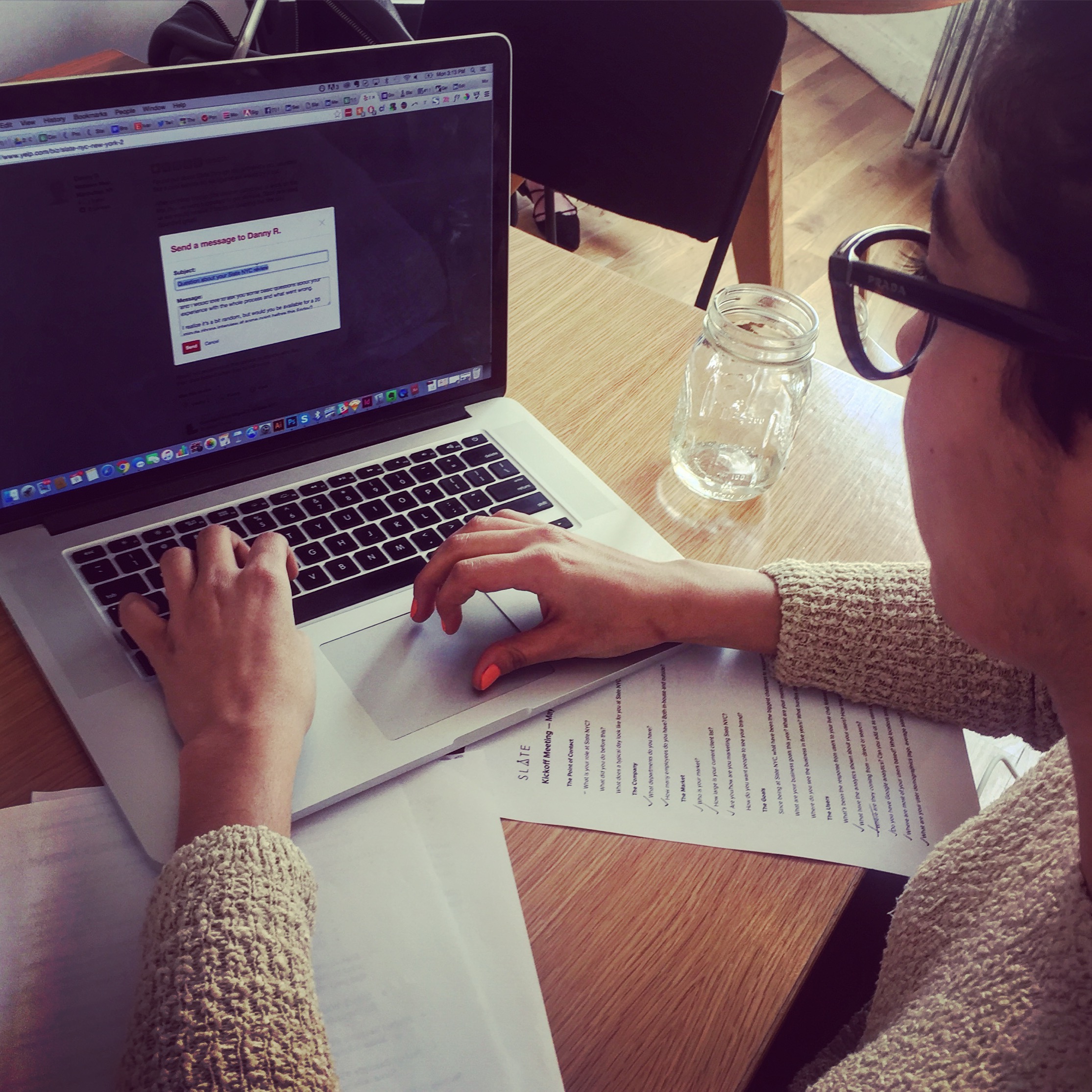
Mor sends a request to interview Danny R., who reviewed Slate on Yelp.
A sampling of the praise we found on Yelp about Slate:
“I am so used to having a spotless apartment everyday that it would be hard to go back to weekly cleanings.
“I just started using Slate and I really can't believe how good it is. Coming home to a clean apartment every day for less than the price of my weekly cleaning lady is amazing.”
“I can text with Alyssa with special instructions or requests and she gets right back to me. It's great!”
A sampling of mixed reviews from Yelp:
“Their customer service is nice but not very efficient. After my review, the owner contacted me and solved the problem immediately.”
“The cleaning staff are all very hard working but need a bit of direction ...”
“We have communicated this with Slate week after week and have received prompt apologies, but the issue continues to persist and one of the charges has yet to be refunded.
A sampling of negative reviews from Yelp:
“They left my laundry in the locker for a week. It's until I send them an email they realized they haven't pick it up yet.
“When I came home, the door was unlocked...Doesn't matter how good the cleaning is, the disregard for the safety of our belongings was unacceptable.”
“A bill of $140 came to me and I was totally shocked. I guess the person who processed the order probably never see the order contents, which I would strongly suggest to improve.”
The test subject also uses the desktop site for the first time. Feedback was crucial to validate our heuristic analysis.
One of our test subjects uses the Slate app for the first time. We recorded audio and video during this session.
After our research on Yelp, we tested Slate’s responsive design of the desktop site, as well as, the native mobile app with four users.
We set up a laptop with a browser, asking each of the participants to give us their initial impressions about what they saw. They talked about the messaging, icons, call-to-action prompts, the tone of brand and the flow from the main navigation to the footer. With the app, we asked users to not only give us their first impressions, but also try to request that a housekeeper clean out the fridge or cancel a housekeeper visit on Friday. The results were pretty striking in their similarities, both in what users said they experienced and in what we observed during the tests. Our ultimate goals were to see what about the site was successful and what tripped users up. We also wanted to validate our initial assumptions about the site we'd made ourselves.
Here are some of the key observations from our users, and some of what they said when using the website and app:
“That’s really interesting, that they actually own the whole process. I would have assumed they would just give [the laundry] to another company they partner with. I kind of feel like this is something I would have liked to know [earlier].”
— User 1, upon using the Slate website
“I think it would be nice if there was a clear distinction between what was different every day and what was the same … it’s so easy to make my bed and take out the trash … but the deep cleaning is something I would hire someone for.”
— User 1, upon examining how Slate schedules home cleanings
“There is no need for this to be here, it’s too much information and details on this page, and the first four things are almost all the same.”
— User 4, upon examining how Slate schedules home cleanings
“So, I guess this is every day? I think I want more information ... like, what is entailed in a full clean? How clean do they get everything?”
— User 2
“I’m a little unclear as to what’s happening, wait a sec, what am i getting into? Laundry service or are you going to clean my house?”
— User 2
“I’d rather do this research on my own, I can do this on my own, I don’t need them to show this to me…I feel like there’s a lot of unnecessary information that I don't want, and not enough information I do want.”
— User 2, upon examining the chart on competitors
“Wait, why is it $5 a day? I thought it was $20 for the cheapest option? What do I get for $5 a day?”
— User 1, upon reaching the end of the homepage
“It says ‘Elisabeth.’ Who is Elisabeth? I’ll go back to my timeline. No wait — who is Elisabeth? I guess that must be my customer service lady?”
— User 4, when reviewing the “My Home” page
“I’m confused about what is a daily task and what is a deep clean task? Is make the bed only deep cleaning? Everything except make the bed seems like a once-a-week task. I want to know more about these tasks.”
— User 3, when reviewing the “Room Tasks” page
”If I text them, I’m kind of wondering who that goes to? Is it my housekeeper or a general help center?”
— User 3, on the "Help" page
The project focus would eventually narrow on the website, but the user feedback from our app testing would prove valuable nonetheless in Slate‘s pursuit of future improvements.
The insights from our user testing would substantially inform decisions during the design phase.
learning about potential users
After our initial heuristic analysis was complete, we began the process of locating potential users to interview about their housekeeping preferences.
In order to narrow the field of users to survey and interview, we assembled a screener with five questions and sent it out to our social networks on Slack, Facebook, Reddit and Twitter. The questions were meant to draw out users who have used an on-demand home cleaning or dry-cleaning service and/or had the experience of hiring a housekeeper to clean their home.
From this pool of users, we would conduct phone interviews and send out follow-up surveys. Because our other stakeholder interviews were set for the next day, we quickly began to write a screener for potential users of an on-demand home cleaning service. We knew that access to Slate’s current and former user base would provide a gold mine of valuable insights, but we had to wait for Slate to provide the list of users to us. In the meantime, we would reach out to our individual social networks in search of potential users to Slate’s service. Access to these users via interviews would help us understand the needs and pain points of those who use housekeeping services in general.
We sent the screener, with five questions, through our Facebook, Slack, Twitter and Reddit channels. We eventually received 44 responses. The questions were:
- Do you live in either Manhattan or Brooklyn?
- Have you paid to have your house cleaned within the last few years?
- Have you used any of these on-demand apartment or home cleaning services? Check all that apply.
- Do you have your clothes dry cleaned?
- If so, how often?
We also asked if any of the respondents would be available for a one-on-one phone interview. Of the 44 who responded, 13 were open to an interview, but only about half of those had used a housekeeper in the past.
behaviorial data in surveys
We provided Slate with a survey to send out to its current users. What we wanted to find out was not just about their satisfaction with the service, but how their customers used the service. Slate sent out the survey to more than 100 of their current users with a promotion attached. These are the trends we found in the 18 responses we received:
current users
For Slate’s former users, we wanted to know mainly why they cancelled, but much of the quantitative data from the survey was valuable, as well. We crafted the questions for the survey and Slate sent it out to about 100 cancelled users. We got a small sample of 19 responses. These are the results from that survey:
former users
From the survey responses, we learned a great deal about why users would reach out to customer service. Surprisingly, many of the questions for both current and former users were about “the sign-up process,” “wanting to know more about the service” and “billing questions.”
The biggest takeaways from this data is that a large percentage of users were contacting customer service on issues directly related to the messaging on the website or signing up for the service. Many users had trouble signing up. For former users, 35.3 percent left the service because they weren’t happy with the site. Our goal to optimize the website messaging and onboarding was ultimately validated.
user trends
But when you look at the survey data in sum, beyond realizing that 35 percent of users canceled because they weren't happy with the site, other problems related to the site become apparent:
Between 50 and 72.2 percent of users had to contact customer service about a billing question. Some of these questions could have likely been answered if the website was clear enough for users to understand the payment schedule.
Between 33.3 and 44.4 percent called customer service because they wanted to know more about the service. Again, a failure of the site to properly communicate its value proposition.
Between 16.7 and 33.3 percent of users called customer service because they needed help signing up. This is ultimately a failure of the onboarding process.
A overwhelming percentage of user contacted customer service before or during the sign-up process. Again, proof the onboarding process is clunky.
It should also be noted during our stakeholder interviews, customer service managers appeared to be overwhelmed with calls from users. Maybe updates to the site's messaging and overall design, as well as onboarding flow, could reduce the call crunch on customer service.
notes from interviews
When we took to Yelp to learn some general user feedback about the service, we also reached out to some of the commenters to set up potential interviews.
In order to facilitate the scheduling of interviews, I signed up for Calendly to set up a selection of dates and times to send out to potential interviewees. There were 15- to- 30-minute intervals between each timeslot to allow our team enough time to distill insights from each interview.
Two users responded, and we set up phone interviews with them. Both thought the cleaning thorough, but cancelled due to other issues. Despite the fact that Yelp reviews should be taken with a grain of salt, we sought to determine and evaluate some initial impressions about Slate, at least in the abstract.
User 1, 27-year-old, works in hospitality: Dissatisfied. Found Slate through his girlfriend in December 2015. She worked for Birchbox and got a free trial offer through the company. “Figured why not, let’s give it a shot.” Used the service for one day only. “The cleaning itself was great. Our apartment was clean and well-organized.” But keeper left user’s front door wide open after cleaning the apartment.
User 2, 28-year-old, musician: Liked the cleaning, but eventually switched to Handy after the first week. Has used multiple on-demand home cleaning services such as Handy and MyClean. Found out about Slate’s free trial through Via promotion. Intrigued by Slate because of app. App “had a few bugs in it.” During promotion week, he was frustrated that he had to let in the keeper every day. “I don’t need it cleaned every single day.” Thought Slate’s one-time cleaning price of $79 wasn’t competitive, switched to Handy to have less regular cleaning schedule.
The ultimate takeaway from these Yelp users: During the free trial promotion, “the cleaning itself was great,” but I don’t “need it cleaned every single day” and “the disregard for safety of our belongings was unacceptable.”
“Doesn't matter how good the cleaning is, the disregard for the safety of our belongings was unacceptable.”
— User 1, talking about his experience with Slate

Notes from a phone interview.
potential users
From the 44 responses we received from users from the potential user screener, we were able to interview six of them by phone. These six had either had a housekeeper or used an on-demand home cleaning service. Each conversation was 15 to 20 minutes in length. In our calls, we asked them about their responses to the screener, as well as questions we wrote out beforehand to try to understand the behaviors and motivations of these potential users. These were the main insights from each of the conversations:
User 1, 26-year-old, Brooklyn: Found Handy through friend. Not home during cleaning. Drops off laundry or has dry cleaner pick it up. Used Handy: “They kinda just cleaned how I would do a base clean. I wasn't impressed.” Wants a deeper clean if hiring a keeper: “I was expecting to have a deeper clean.”
User 2, 58-year-old, Agoura Hills, Calif.: Has had same housekeeper for 1 year. Found through friends. Keeper comes every other week, 6 to 8 hours a visit. Keeper does not do laundry. She communicates through texting. They aren’t home when keeper visits. They dry clean a few items monthly. Pays cash.
User 3, 29-year-old, New York City: Had a housekeeper through a roommate who came twice a month, paid cash. But when roommate left, transition was a problem, they raised their rates, didn’t know how to negotiate. Also used Handy, every other week. Confusing at first, too many choices, but eventually “totally worth it.” Not high-maintenance, just wanted tidying up and bathroom and kitchen surfaces clean. Price is the biggest consideration, then scheduling and ease of sign-up.
User 4, 52-year-old, Agoura Hills, Calif.: Found keeper through friend. Has had same housekeeper for 4-5 years. She comes once every two weeks, 6 to 7 hours a visit. Annoyance: “They stop really cleaning the way they do in the beginning.” Likes keepers to “clean more in-depth.” Uses a translator to talk to housekeeper. Stays home during cleaning: “I feel more comfortable this way, I trust her.” Likes to have the same person every time. Pays cash.
User 5, 45-year-old, Manalapan, N.J., Brooklyn: Has had same housekeeper for 1 year. Comes by weekly, on Thursday, pays them cash. Found housekeeper through community page on Facebook. The ultimate goal is for the keeper to be autonomous. Communicated through notes, homeowner speaks Spanish. Is home when the housekeeper is there.
User 6, 58-year-old, Oakland, Calif. Found keeper through friend. Keeper comes once a week for 8 hours a day. “She does everything! Everything!” Typically stays home with keeper in the beginning to “build trust.” Has had current keeper for 3 years. Pays cash.
The data from these interviews was enlightening, such as how people found their housekeeper, but other data was inconclusive, such as our users’ experiences with on-demand home cleaning services:
How did you find your housekeeper? 5 out of 6 users found theirs through a friend or roommate.
How many used an on-demand cleaning service? 2 out of 6 users had used Handy. One said it was “totally worth it.” The other, “wasn’t impressed.”
How often does your housekeeper come? 3 out of 6 users had housekeepers come twice a month. 2 out of 6 had them come once a week.
Are you home when the housekeeper is there? 3 out of 6 users are home with housekeeper.
current and former users
From the surveys, we talked with four users who were willing to be interviewed over the phone. Two of the users were former users of Slate, who quit the service within the last month. The other two are current users of Slate, but each one receives housekeeping services at different frequencies — one, every weekday, the other gets it for 5 days a week, then cancels, and only signs back up when he needs the cleaning again. Here are the insights we gained from each of the current and former Slate users with whom we talked.
User 1, an early adopter: She has a 4 bedrooms, 3 bathrooms. Free trial is what got her interested in signing up for the service. This user was one of the first people to sign up to use Slate’s service and recommended it to a lot of her friends. She gets the service 5 days a week, but finds 1 hour is not enough time for her housekeeper to do the job properly. She finds it difficult to communicate with her housekeeper because of the language barrier. “If I’m not there to explain it to them in person, then forget it, I don’t want them there.” In the beginning, she needed to text or call the customer service line a lot more. One day every other week, the keeper simply doesn’t show. “I’ve given up, not sure what to do.”
User 2, 28-year-old, East Village: Has a studio apartment. Found out about Slate through a flyer in his mailbox for one free week. Has been using the service on and off once a month. “Because I don’t make much of a mess, and most of the time I clean up after myself. There are times I just want my apartment to be professionally cleaned.” “I don’t do enough damage to warrant a daily clean.” He doesn’t really feel the need to communicate with his housekeeper and tries not to be home when she’s there. He finds the customer service really responsive, and has only used Slate to clean his apartment.
User 3, 25-year-old, Upper East Side: Has 1 bedroom, 1 bathroom. Found Slate through a Via referral. Grew up in New Jersey with an au pair and a cleaning lady in his home. Used Slate for a week and a half. On first day, keeper didn’t lock user’s door behind her. Really not satisfied with cleaning, main reason the user cancelled service. The cleaning didn’t meet his expectations. User was very happy with customer service response. He gets dry cleaning once a month. Found 5-day-a-week service to be “strange” and not efficient use of services. He would prefer not to be home when housekeeper is there.
User 4, Morningside: Used Slate several years ago for her laundry needs. Had Slate for one week. Had a difficult time signing up online through the website. Found the app to be buggy and confusing on some screens, such as on the timeline. Times were not accurate in the app. “I mean it’s pretty, but the functionality isn’t there.” Didn’t need someone to clean up 5 days a week for an hour at a time. Preferred housekeeper for 2-hour visits twice a week.
The qualitative insights from all these interviews, in conjunction with the quantitative data from our surveys and analytics, would guide the creation of our personas and, subsequently, the overall design of the website.
contextual inquiry in brooklyn
To better understand the laundry and dry cleaning process at Slate, we visited their facility in Greenpoint, Brooklyn, for an hour. Once there, we met Eduardo, the general manager, who gave us a guided tour. What we saw in action was a state-of-the-art garment tagging system that was able to track individual clothing items as they went through the drop-off, cleaning and pre-delivery process. The labeling of each garment bag was also very detailed and organized, with each users preferences of how to deliver the items, as well as what items specifically are inside the bag. Communication with keepers and drivers was also done in the back of the facility on Mac laptops.
The entrance of Slate's dry cleaning and laundry facility in Greenpoint, Brooklyn.
An employee attempts to remove a stain from a garment.
An employee presses shirts at the dry cleaning and laundry facility in Greenpoint.
Slate’s tracking system gives each garment a unique I.D.
Soem of the laundry machines at the Greenpoint facility.
Eduardo gives us a tour of the state-of-the-art laundry facility in Greenpoint.
Eduardo and his staff coordinate the schedules of the keepers and drivers from the Greenpoint facility.
Air is blown through a garment on the line.
Also, Mor signed up for a free trial of Slate through the native app so that we could evaluate the experience of the service. The process of signing up through the app was slightly frustrating for her, per the observations from our heuristic analysis of the onboarding flow. The end of the flow didn't provide sound feedback on the screen as to whether or not Mor had succeeded in signing up. An email sent from Slate moments later provided confirmation and further instructions on setting up a preliminary in-person appointment with Amanda, the community manager, at Mor's apartment to initiate a walkthrough.
For the first couple days, the service was inconsistent. This was an email Mor sent to Amanda about her experience:
“I've had a bit of confusion about my service so far. Although we made the schedule for the week together (when you came by my place), it seems that my keeper isn't really sticking to it.
Yesterday was supposed to be my bathroom, however the house overall was tidied up, but no one room was "deep cleaned". Today, a bit more of the bathroom was done, but my bed wasn't made and I couldn't tell if any other room had been cleaned further.
Also, we talked about the keeper bringing me a laundry bag yesterday so I could put my laundry inside the bag to be picked up today. Instead, she had taken my entire laundry hamper to the facilities, and it was a bit stressful as I wasn't aware she was taking it, and most of my clothes need to hang dry. ... Would love to get your opinion the weekly schedule and how I should proceed with the laundry.”
Slate promptly addressed Mor’s complaints and by the end of the week, service was much improved. However, some of what Mor experienced was similar to what some users experienced when we spoke to them in interviews, and in what they told us in surveys.
refining the problem and opportunity
With all of our research, from brand analysis, stateholder interviews, contextual inquiries, heuristic analysis and user testing results, we walked away not sure where to attack:
The Console: Improve functionality, communication abilities — stakeholders need more efficient system to handle requests and scheduling changes.
The Native App: Messaging, accuracy — most people who use the app according to our surveys are happy with it, however, there appear to be noticeable bugs, namely accuracy with who the keeper is and when they will arrive. If that were fixed, it would be more reliable for users in short term.
The Website and Onboarding: Messaging confusing, mobile site is unusable and gives off a bad impression. Onboarding flow is faulty.
After presenting our research results and conclusions to other UX designers during stand-ups and pin-ups, we decided to redesign the website and onboarding flow. Our data validated the need for these changes the most.
Early research and insights were presented to the group, along with a problem and opportunity statement.
Mor examines feedback from the group during pin-ups.
The redesign of the website and onboarding flow would resolve the needs of users and Slate‘s business interests simultaneously. If the redesign would be successful, it would need to improve the user experience and more affectively communicate the value proposition. These improvements would translate into greater lead generation, less customer service call redundancy and overall happier users.
The Problem: Slate needs to increase the visitor-to-lead conversion rate on its new responsive design desktop site. Too many visitors are not clicking through to the sign-up process.
The Opportunity: Improve the messaging and usability of the website and onboarding flow through the web app. This proposed solution will help improve users’ experience, better communicate Slate‘s value proposition and simplify the onboarding process. We project these improvements will lead to a higher overall visitor-to-lead conversion rate, fewer unnecesary calls to customer service and a more loyal user base.
the target user
After all of our interviews and surveys were completed, we compiled all of our insights together and, through the process of affinity mapping, found trends in the data. Our goal was to boil down to the essence of all our research to find key motivations, behaviors and pain points for those current users, but also prospective and cancelled users of Slate. These were the behaviors and motivations we found in our research. From these statements, we would build targeted user archetypes, or personas, to guide us through our design. Here are some of the trends we found in the data:
- “I need my housekeeper to be on time every day.”
- “I need to be notified when my housekeeper isn’t available.”
- “I have a problem communicating with my housekeeper.”
- “I want to be able to communicated directly with my housekeeper.”
- “When I hire a housekeeper, I expect a deeper clean.”
- “I want prompt customer service, day or night.”
- “I want to have the same housekeeper all the time.”
- “I want my housekeeper to know my home, inside and out."
- “I get frustrated when things are done wrong.”
- “I want to trust the person coming into my home.”
- “I found my housekeeper through a friend.”
- “I found my housekeeper through an advertisement or promotion.”
All of our insights from interviews and surveys are organized on the wall in separate groupings before we divide them into trends.
The insights in the potential user grouping.
The insights in the current user grouping.
During affinity mapping, questioning the inclusion of one particular insight in one category over another.
During affinity mapping, we found trends in the individual insights.
One category as part of our affinity mapping was "wants from a service."
Mor groups insights into their natural trends.
As we entered the design phase of our project, Nadine, our primary persona, would help us validate our decisions. We would ask ourselves, “Is this something Nadine would need?” Nadine is the “neat freak,” a high-maintenance user who prefers to have the job done to her exact specifications and eventually without oversight of the housekeeper. Her goals, pain points and needs fit the majority of users we interviewed. If our primary persona is highly detail-oriented, we would need to address every detail on the site, so potential clients don’t walk away with more questions about the service.
Our other personas would also help guide our decisions during the design phase of the project, but their needs were secondary to Nadine’s. James, the bon vivant, is a low-maintenance user who wants to have a clean apartment on a consistent schedule, but without the inconvenience of needing to be at home with the housekeeper. Wendy, the spring cleaner, on the other hand, is the irregular user, someone who cleans up after herself, but may need a deeper clean every once in a while. Slate‘s typical user is a daily user. But Wendy, while more likely to use Handy or another competitor for her particular needs, still mirrors insights from former and potential users of Slate.
feature prioritization
Before we began sketching, we put together a graph prioritizing the features between “Essential” and “Nice to Have” versus “High Effort” and “Low Effort.” We wrote the name of each feature, informed by our research, on a Post-It note and stuck it to the wall. Features between the desktop and web app were split evenly, with most of the high-effort ideas from the app category. In the end, we wanted to assess where to put the most focus.
These features found their way to the essential side of the quadrant.
Anthony writes individual features onto Post-Its for us to tack to the wall in groupings.
Basic features, such as a checkout flow, task management and a pricing breakdown, are highly important and require lower effort to develop and design. More complex additions, such as a feature to allow housekeepers to check-in and check-out of a user’s home, would require far more development and testing. The “Musts,” equally divided between desktop and native app, were the features we decided to ultimately include in our visualizations.
the design studio
Once the feature prioritization was completed, we began to hash out ideas on paper, sketching navigation, pages and user flows in Sharpie. From each of our individual sketches, we took to a whiteboard to iterate those ideas.
We had several objectives for the redesign:
- A clear understanding of the service, how it works, pricing options and how to sign-up.
- Reassuring users that the service and housekeepers are trustworthy and reliable.
- Providing an easy, smooth sign-up and onboarding process.
- Speak to potential users’ aspirations.
- Use modular blocks of content, like Handy and Alfred, to give the design flow and contrast and allow users to digest the information more easily.
Fulfilling each of these objectives would not only improve the user experience, but strengthen the brand’s credibility.
From our collective whiteboard sketches, we began to build medium-fidelity wireframes in Sketch, and later a working prototype of those wireframes in InVision. To eliminate as many visual distractions as possible, the prototype was monochromatic and void of photography. Once the prototype was ready to test, we sought feedback on flow and hierarchy, even curious if changes to how and where the prices were presented would eliminate confusion. Microcopy was written for essential features, while brand voice and messaging was put on hold for the high-fidelity mockup.
My pile of sketches during the ideation phase of our project.
Anthony sketches some ideas during the exploratory design phase of the project.
For the first iteration of the design, we ended up with 5 options in the top navigation: About, How It Works, Pricing, Login and Get Started. The footer would include a “Help Center.” If you include the homepage, the site would have four other pages: A “Pricing” page, explaining the service options and dry cleaning and laundry costs; a ”How It Works” page, which would show how the service works; an “About” page, with a brief story about the company and its stakeholders; and a “Meet The Keepers” page, which you would get to from the homepage or “About” page.
As far as fonts, we used various weights of San Francisco, Apple’s versatile neo-grotesque san-serif, in the wireframes because we didn't have a license to use Slate's current webfont on our desktops. We didn't have many weights available to us for Helvetica or Helvetica Neue. The utility of San Francisco worked for our purposes: To clearly and consistently communicate the messaging hierarchy in our prototypes. Distracting or difficult to read type would hurt our ability to properly test our work. We would eventually recommend to Slate further research and testing of fonts for the redesign.
Here are the general design specifications on our first iteration, including wireframes of the desktop version of the website and sign-up and onboarding flow in the web app. Since the desktop version, according to our research, is where most users signed up for Slate, our focus was completion of a working desktop prototype.
In our redesign of the sign-up and onboarding flow, we begin the process with a prescreen that requests a ZIP code, so that a user doesn't waste time applying for a service that isn't available to them. We set out to make these additional improvements to the sign-up flow:
- Make the profile and payment forms to one screen each.
- Include a progress bar, so users know how long the sign-up process will take.
- Allow users to make their plan selections to streamline the process for users and customer service.
- Offer confirmation when the sign-up process is complete.
Our research would lead us to make these changes to accelerate lead generation and improve customer service for users and employees. User testing would validate it.
user testing
We tested our medium-fidelity prototype with 11 users, some on the mobile version through our iPhones, most using the desktop version through InVision. We set up a temporary testing area with a laptop and, after some warm-up questions, asked users for their first impressions of each page. We also had each user try to complete the sign-up and onboarding process.
Mor (right) and Anthony (center) talk with a user after they work through some scenarios on the first iteration of our Slate site redesign.
After first impressions were documented, we gave our users a scenario based on our primary persona, Nadine: “You are a mother living in Gramercy who needs a daily cleaning, as well as laundry pick-up. You want to sign-up for a 5-day-a-week cleaning. How would you go about it?” Insights from these user tests led to massive changes to the design, as seen in the high-fidelity mockups.
The key insights from our user testing included:
- Users said they were very overwhelmed with the amount of content on each page. Too much type causes user to quickly lose interest. Information overkill.
- We observed some users getting stuck in the sign-up process, slowed down by too many questions about preferences and the tedium of checkboxes.
- The graphics to help explain the prices and plans on the “How it Works” page didn't help clarify the already confusing subscription offerings.
These are some of the iterations we made after user testing:
We combined the “Pricing Page” and “Choose Your Plan” page into “Our Services” page. This was done to make it easier and have less steps for users to find all the information they need before they signed up.
We split the “Preferences” in the sign-up flow into “Getting to Know You” and “Laundry Preferences.” We did this to break up the onboarding into more digestible chunks, but also to allow the laundry section of the sign-up to be conditional based on whether or not users opt into laundry services.
the final design
After making extensive changes based on the input from our user testing, our second and final iteration would have two pages branch off of the homepage — “About Us” and “Try Slate.” There would also be a “Login” for current users to sign-in to their accounts and onto the web app. In the footer, there would be an added “FAQ” and “Our Services” link, which would travel to the “Try Slate” page.
Our first design was five pages. With the changes we made after our user testing, our second design shrank to three pages. The addition of iconography and the realignment of key content across the site resulted in a more clear, concise and user-friendly design.
Here's the sitemap for the second iteration of the website:
Using our targeted users, i.e. personas, as inspiration, as well as data from user testing, we developed a user flow in conjunction with our second iteration. This user flow begins on the homepage and shows how a user would flow through the site from discovery to sign-up.
For the final design, we brought in photography, color and new iconography. Here's what our thought process was on each:
Photography: We thought the photography should speak to the aspirations of potential users. We also thought to set itself, Slate should “speak to the New York experience.” Handy mostly uses stock photography, some of which is substantively and stylistically out-of-touch with New York City. Slate provided us with black and white photos of their employees, including housekeepers. We embraced the black and white photography for its classical elegance, and used supplemental shots from our contextual inquiries to fill in the gaps on the ”About“ page.
Color: The Slate app uses a vibrant green, but the website uses different hues of blue. In order for there to be a consistent and unique brand vision, we borrowed the green from the app and used it for pop on the website. To communicate New York elegance and luxury and to set itself apart from the competitors, we chose to anchor the design in black, white and shades of gray.
Iconography: To keep the storytelling fresh, we updated the iconography across the design, and put in pops of color to add depth. The map on the homepage was also redrawn to accurately represent Slate’s coverage area.
Here are the annotated versions of the final designs for the desktop and mobile versions of the website, as well as the sign-up and onboarding flow for the web app:
next steps
After this 17-day UX process, there is so much we learned about Slate and its potential, current and former users, including data from user testing on their current native app. Here are some of the recommendations we presented to Slate at the end of the project:
Short-term
- Continue to user test the new design and iterate new versions of the design as needed for further testing.
- Work with Roberto, the developer, to implement design changes and determine whether some of the new features or functions can be done with the existing site.
- Iterate a tablet version of the responsive site.
Long-term
- Make some functional changes to the app to improve user experience.
- Have more testimonials written, preferably accompanied with photos of your customers.
Granular
- Have photography shot of your staff and keepers to make the site’s photography more cohesive, colorful and aspirational.
- Have additional copywriting done. The microcopy should align with the brand mission.
- FAQ page needs to be designed written and developed to the site, with detailed laundry and dry cleaning pricing and frequently asked questions about the service just in case a potential user wants to dig in deep. This is also available on the native app.
- Research and test new fonts for readability, scannability, brand vision and overall technical performance for the website redesign.
Conceptual
- Additional user interface design is required. All icons should be bought or designed to align more seamlessly with the look of the site and the brand identity.
- Have photography shot for your hero images that best reflect your brand and service. Pictures inside the dry cleaning facility or inside the home of a current user.