

Mood Streaming Music App
For my first User Experience Design Immersive (UXDI) project, I developed a prototype for a media player app in less than 5 days.
This is how I did it.
my Initial assumptions
What is a media player? What could it be? It could be for video and/or audio. It could stream content from the cloud or simply just access content from a mobile device. It could be a platform for content that is 15 seconds or 2 hours in length.
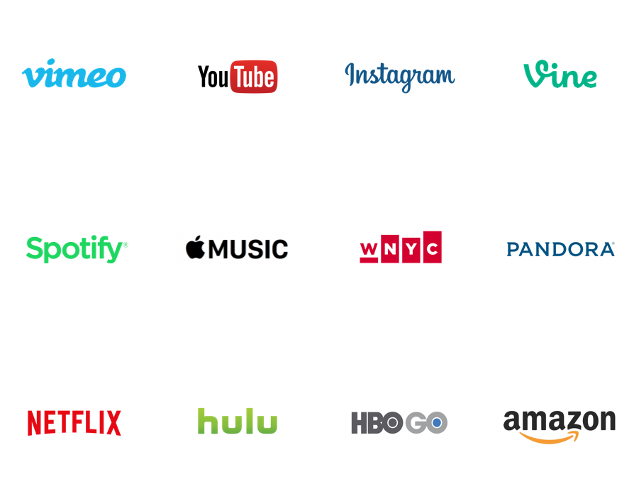
I made a list of a variety of current media player apps on the market that I’d used before. For long-form video, I thought of Netflix, HBOGO, Hulu and Amazon. For short-form video, YouTube, Instagram, Vine and Vimeo quickly came to mind. For audio, I'd been somewhat familiar with Spotify, Apple Music, Pandora, WNYC and Audible and Stitcher. I also made a list of the common microinteractions users encounter when consuming content on these apps.
This initial research would help me understand users' expectations. What do they expect from a media player? Why is one media player preferred by some over another?
Interviews
I conducted three interviews for this project, each 20-30 minutes in length, each user from a different demographic. I wrote out my questions in advance, but tried not to completely rely on them during my interviews.

My script included questions that began with who, what, when, where, why and how, such as “What type of device do you use?,” “What types of content do you consume on your device?,” "What apps do you use?,” “When and where do you use them?” and “How do you use them.”

“Why do you listen to music?”
— One of the most important questions I asked during my interviews
Despite the script, my interviews quickly turned more conversational. As I became more comfortable asking questions, the users I interviewed would, too. Deeper into the conversations, I would ask more questions beginning with “Why” — questions that cut to the core of their experiences and can be more quantitative. “Why do you listen to music” was a big one. As was, “What does music do for you” or “How would you describe your relationship to your music.”
Each interview informed the next one.
I found someone who was standing on the sidewalk at Broadway and 22nd, gazing into their mobile device. I took advantage of the moment to ask him about his media player preferences.
With all three interviews, my goal was to cut to the heart of the users' motivations and behaviors.
As it turns out, for the users I interviewed, music is practically hard-wired into their daily lives. Video remains a novelty, a occasional distraction from waiting in line or a long commute. Music is their lifeblood.
After collecting a lot of dots, I would take the most notable insights from the interviews and begin connecting them. Patterns would eventually emerge. I would eventually use these trends to inform my design.
DISCOVERING TRENDS
From the three interviews, I wrote down the most salient points on Post-Its — a color for each user — to begin affinity mapping, a design process to help organize and synthesize data to better reveal patterns, relationships or themes in the research.
THE Trends
From the affinity mapping, I discovered my users …
- More often than not, are listening to music during the day.
- They’re not sharers. Music is something personal to them.
- They are “song people,” not so much “album people.”
- They like to be pleasantly surprised and are turned off by bad recommendations.
- They mostly use streaming services to get their music, which is related to their preference of hearing random songs.
- This is also why they don’t buy music, unless of course, it completely speaks to them.
- They choose what music to listen to based on how they feel in the moment, and what activity they might be doing.
- For one user, it was more explicit that selecting music based on “artist” or “genre” isn’t useful to them. I returned to my notes, and found the other users were neutral on that function, but their motivations suggest it might be otherwise. The apps from my initial research primarily sort music by “artist” and “genre,” and while there are opportunities to create playlists to user tastes or preferences, it’s not common.
The opportunity


From the synthesis of my interviews and observations, I discovered the problem is that music app users don’t have an easy way to consume new music that fits their mood or activity.
My solution is to design a streaming music player that enables users to create playlists based on their mood, activity or how they want to feel.
My target user is “The Listener Who’s In Touch With Their Emotions.”
Sketching
With my problem and solution set, I began sketching out ideas for how to make an appealing, highly functional streaming music player for users. Using a Sharpie, I put my ideas to paper. In the beginning, to match trends in my interviews, I designed the app to allow users to select music by activity or emotion. "Muse" was the original title of the project.

first screen
The onboarding screen includes prompts for "I Feel" and "I Am."

“I Am” Landing screen
The "I Am" landing screen includes a list of possible choices to tap on to create a playlist.

“I Feel” Landing Screen
The "I Feel" landing screen also includes a list of possible emotions the user might feel to select to create a playlist.
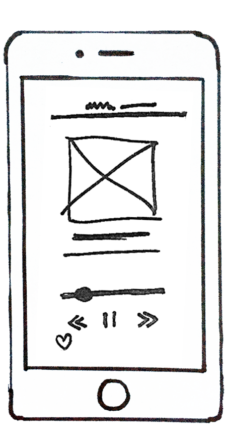
the media player
The song player screen includes common functionality and labeling and a favoriting option.
I showed my initial sketches to a user to get their initial impressions. There was a sense of the confusion about what the app would do for them.

simpler start screen
The onboarding screen is simplified to a "Start" prompt.

mood board
For new users, the onboarding process begins immediately, prompting users to add songs to their playlist.

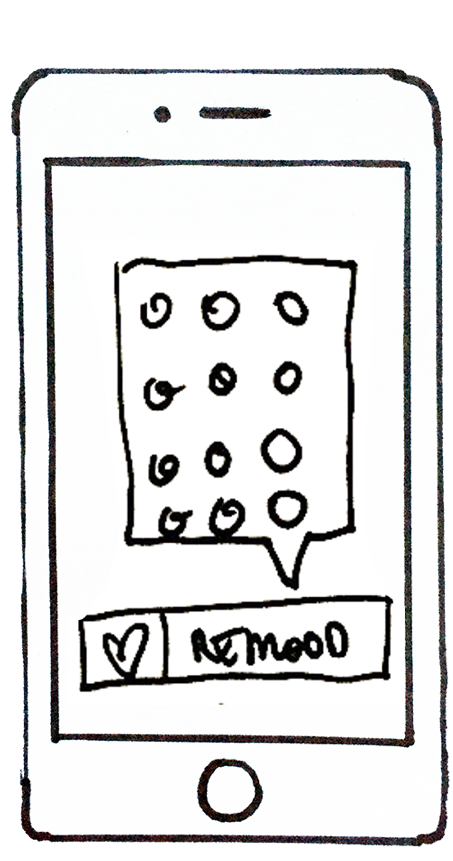
new pop-up
When they add them, a pop-up prompts them to choose an icon to signify how the song makes them feel. This process goes on for the length of the progress bar.

Playlist selector
After onboarding, the user is prompted to choose how they feel.
So, I simplified the overall scope of the app to traffic in moods only. The change gave me the opportunity to create an onboarding screen to prompt users to "Create Your Mood Board." It also allowed me to simplify the selection of moods from words to icons. I tried to make the start screen speak more to the nature of the how the app is designed to interact with users. I also went away from text and toward emoticons as a way to make selections. This input lead to a refined first prototype in POP.

media player redrawn
When they choose an emotion, a playlist that contains music fitting that category immediately begins to play in the song player.
reclassify a song
If a song doesn't fit they mood they choose, the user has the opportunity to reset the song to a different mood.

onboarding revision
A revision of Screen 2. "How Do These Songs Make You Feel?" is more intuitive than "Create Your Mood Board."

types of icons
A revision of Screen 3. Icons are more identifiable as emoticons.
Prototyping

high-fidelity sketch
I sketched higher-fidelity versions of each screen for the prototype.

time for play
I tore pieces of paper to build in the functionality into the app.

Using pop, or prototype on paper
I made higher-fidelity sketches and uploaded them into POP on iOS. From there, I made my first prototype.

the onboarding screens
Further iterations were made to the sketches in their higher-fidelity versions. There were a total of six main screens.

the playlist screens
Icons and buttons were more defined from the earlier sketches in this first prototype.
Testing
Once the prototype was complete and functional enough to user-test, I approached two different users to ask if they had 15 minutes to try out a new app I was testing. Before testing began, I engaged them in a conversation about their habits and behaviors regarding streaming music. One was an avid streaming user, the other didn't use streaming services and preferred to listen to her own music library. At the start of each test, I asked them if it would be okay to record the conversation for testing purposes only, to which they agreed.

My second user test

My first user test
In both tests, I had written out a script of objectives beforehand.
- Show the user the home screen and ask for their first impressions.
- Ask the user to set up their own playlist on startup.
- Ask the user to access their music to listen to a song.
- Ask the user to designate a favorite song or change the status of how a song makes them feel.
- Ask the user to return to the home screen.
Findings
In observing the users during the testing and in the video recordings seen afterward, I got some very actionable feedback.
- In both tests, users responded with surprise and positivity to the home screen. Warm smiles. One user said, “It looks fun.”
- The language isn’t intuitive, and at times too technical. “‘Build?’ That sounds like work” was one of the comments made in reference to the home screen button you’d press to create a playlist. “Redefine” was also another work which users were slow to respond.
“‘Build?’ that sounds like work.”
— User Tester 2
- Some of the logos in the navigation were confusing. Some of the users didn’t press on buttons because they didn’t look like buttons or weren’t sure what they would do. This happened on the music player screen during the task which ask a user to change the classification of how a song made them feel.
- The feedback screen when changing the mood classification of a song was confusing to the users. They weren’t sure what was happening.
- Both users said they would use the app if available on the market. One user said, “It’s better than Pandora.”
“It’s better than Pandora.”
— User Tester 1
- Both users liked choosing music through emoticons, but one user worried that there were too many from which to choose.
- One user, Rachel, who is not a streaming music user, seemed to enjoy the process of creating a playlist, which was an encouraging sign for a potential growth market.
- Rachel said that she listened to music in the car a lot, and thought the home button should be bigger.
Second Iteration

the onboarding screens
Based on testing, the call-to-action messaging was changed, and I cut out options on the "I'm Feelin'" screen.

the playlist screens
Beyond new messaging, a "New Mood" button was added and a selection pop-up on "Move" button made the re-classification process simpler.
Based on feedback from the usability testing, I made changes to the app in POP.
- I changed the terminology to make it more inviting and clear. “Build” became “Create a playlist.” “Redefine” became “Move.” “Play” became “Play Music.” “React” became “I’m Feelin’ It.” The button designed to change the mood classification of a song that confused users was removed and replaced with a larger button that says, “New Mood.” Also enlarged the small home buttons and made the icon — a house instead of a hierarchical hamburger — more intuitive. These changes in word choice also helped to strengthen the brand of the app by tying directly into the app’s overall concept.
- I eliminated one screen entirely and improved the functionality on how to change the mood classification of a song by using a simpler pop-up instead of a mode.
- I removed the number of emoticons from the mood selection screen and mood classification screens to make the app more engaging and less overwhelming.
What I Learned
Throughout this project, I learned how vital preliminary research, user research and interviews, sketching and ideation, and prototyping and testing is to the process of user experience design.
Before design even begins, it’s important to understand the problem you are trying to solve and to substantiate it. I learned to document everything I can, and during the research phase, to collect as many dots as I can to connect later. It’s also important to ask the right questions, to understand your target users and their needs, behaviors and pain points as you design, prototype and test.
Moving Forward
During this project, I was very comfortable with sketching, design and prototyping. User research and testing took me out of my comfort zone, but from those challenges, I found opportunities for growth. I think more exposure to interviewing will help me sharpen those necessary skills and methodology. I will opt to use a voice recorder on any interviews in the future, as the process of taking notes during an interview can interrupt the pacing of a conversation.
After testing the prototype with a user and building another iteration, many new questions arose. Would users want to have songs classified under more than one mood? How many choices of moods would users like before it becomes overwhelming to them? Would users want to create their own moods? Could I develop a signature moment, i.e. a branded microinteraction, that would help strengthen the app’s relationship with the user? Answering these and newer questions would drive further momentum on prototyping and testing new iterations of this app.
Overall, I think I identified and solved a problem that the users I interviewed are experiencing. Moving forward, I would continue to test and iterate to make the app better.